For a basic overview of income inequality in the United States, the Congressional Budget Office provides a useful overview in its report "The Distribution
of Household
Income, 2017" (October 2020). Versions of this report have been coming out for about 40 years. The CBO uses what is called the Statistics of Income, which is based on a nationally representative sample of individual income tax returns collected by the Internal
Revenue Service. Thus, the data for income in 2017 wasn't first reported on tax returns until 2018, and it takes a couple of years before the late tax returns have arrived and the comprehensive dataset can be compiled. This CBO report is really just about presenting the data: you need to draw your own policy conclusions.
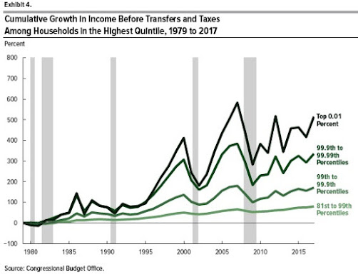
Here's some basic information on growth of income at different points in the distribution over time. The rise in incomes for households in the bottom fifth or "quintile" of the income distribution, not including taxes and transfer payments, was about 35% from 1979 to 2017. The rise in incomes for the middle quintiles of the income distribution was about the same. But here's the pattern at the top. 
Clearly, income growth at the very top of the distribution has been at higher rates. For perspective, the average income (before taxes and transfers) for those from the 99th percentile up to the 99.9th percentile was $1.11 million in 2017; for those from the 99.9th percentile to the 99.99th percentile, average income was $5.67 million; for those at the 99.99th percentile and above, average income was $48.54 million.
Interestingly, the source of income that has grown the fastest is what is called "business income"--that is, income from owning or running a business which at the top level includes often includes partnerships in large law firms, running as series of car dealerships, and other substantial enterprises. The CBO writes:
As a share of income among households in the top 1 percent, business income rose from 11 percent in 1979 to 23 percent in 2017. Meanwhile, average capital income (including capital gains) grew at a slower pace than other forms of income. As a result, it declined as a share of income among households in the top 1 percent of the distribution, from 54 percent of income in 1979 to 41 percent in 2017. Labor income remained roughly constant at about one-third of income among such households from 1979 to 2017.How have the effects of of federal redistribution changed over time, in terms of taxes and programs that tend to redistribute income? Here's a graph showing average federal tax rates over time by income group, where the average federal tax includes income taxes, payroll taxes that finance Social Security and Medicare, and corporate income taxes attributed to those who receive such income. The general pattern is generally lower federal tax rates as a share of income for those at the bottom, and not much overall change in federal tax rates for those at the top. (More detailed breakdowns of federal tax rates for the top 0.1% and 0.01% look a lot like the top 1%.)
What are the effects of federal tax and spending programs in reducing inequality, and how have these effects changed over time? The Gini coefficient is a way of measuring inequality that varies from 0 to 1, with zero being complete equality of incomes. The top line in this figure show rising inequality over time in market incomes. The second line shows the change in this inequality after taking into account Social Security and Medicare payments. The third line shows the change in inequality after taking into account means-tested federal programs aimed at those with lower incomes. The bottom line shows income inequality after taking in account all of the previous changes plus shifts in taxes.
One basic theme that emerges from figures like this is that no matter what metric you choose, income inequality is up. However, it's also true that the combination of government programs has ameliorate the rise in market-based income inequality to some extent: for example, measured by market-based incomed, the Gini rises 13 percentage points from 1979 to 2017 (from .472 to .602), but looking at the bottom line that includes all income and transfers, the rise is about 8 percentage points (from .351 to .434).
