CONVERSABLE ECONOMIST

Pages

  • Home
  • About
  • Contact
  • FAQs

Saturday, April 29, 2017

"But When, Friend, Dost Thee Think?"

As final exams draw near at many colleges and universities (at least for those on a semester schedule), it seems appropriate to pass along this old story as told by Nicholas Murray Butler, President of Columbia University, at the 143rd Annual banquet of the Chamber of Commerce of the State of New York., 1911 (pp. 43-55), and available through the magic of the HathiTrust Digital Library
"I cannot help recalling an admirable story which is told of ROBERT SOUTHEY, once Poet Laureate of England. SOUTHEY was boasting to a Quaker friend of how exceedingly well be occupied his time, how he organized it, how he permitted no moment to escape; how every instant was used; how he studied Portuguese while he shaved, and higher mathematics in his bath.

"And then the Quaker said to him softly: `But when, friend, dost thee think? 
"My impression is that we need now some time to think, in order that reflection and study of principle, and grasp upon realities, may take the place of perpetual discussion and exposition, partly of what is, partly of what never was, partly of what never can be."
Posted by Timothy Taylor at 8:00 AM
Email ThisBlogThis!Share to TwitterShare to FacebookShare to Pinterest

Friday, April 28, 2017

Digital Forces and the Other 70% of the US Economy

For those feeling the need for a bracing dose of optimism about the prospects for US productivity growth, I recommend "The Coming Productivity Boom: Transforming the Physical Economy with Information," written by Michael Mandel and Bret Swanson (March 2017), and published by the Technology CEO Council (which is more-or-less what it sounds like, a "public policy advocacy organization comprising Chief Executive Officers from America’s leading information technology companies, including Akamai, Dell, IBM, Intel, Micron, Oracle, Qualcomm and Xerox.")

Mandel and Swanson split the US economy into two big chunk, which they call the "digital economy" and the "physical economy." In the digital economy, which accounts for about 30% of US GDP, they argue that investment in information technology and productivity growth are doing fairly well. But in the physical economy, investment in information technology and productivity growth have been low. Thus, they argue that there is potential for rapid productivity growth in more than two-thirds of the US economy.

What are the industries in these two economic groupings? The digital economy is: "Computer and electronics production; publishing; movies, music, television, and other entertainment; telecom; Internet search and social media; professional and technical services (legal, accounting, computer programming, scientific research, management consulting, design, advertising); finance and insurance; management of companies and enterprises; administrative and support services." The physical economy is: "All other industries, including agriculture; mining; construction; manufacturing (except computers and electronics); transportation and warehousing; wholesale and
retail trade; real estate; education; healthcare; accommodations and food services; recreation." Obviously, their notion "physical" isn't just material goods, but also includes a number of the biggest service industries like health care and education--as long as what is ultimately being delivered is not actually digital in nature. 

After dividing up the economy in this way, here are a couple of the patterns they find. The first figure compares investment in information technology in the digital and physical sector; the other compares productivity growth in these two sectors.


They argue in some detail that with appropriate investments in  information technology, and the associated rethinking of production and output, substantial productivity growth is  possible in manufacturing, transportation, education, health care, wholesale/retail sales and other areas. One recent example is how how information technology, by allowing dramatically mapping of underground geological formations, has boosted production of natural gas from shale. 

What about manufacturing in particular? They write:
Government data shows that most domestic factories have not added much to their stock of information technology equipment and software over the past 10 years. Between 2004 and 2014, manufacturing IT capital stock increased by just $46 billion, and more than 65% of that gain was in the computer and electronics industry. ... Leaving out the computer and electronics industry, the capital stock of IT equipment in the rest of manufacturing has barely grown since 2000. The capital stock of software in manufacturing is, likewise, barely higher now than in 2000. ...
What about robots? According to trade  association data, 31,000 robots valued at
$1.8 billion were shipped to North American  customers in 2016. The spending on robots
pales next to the $300 billion in industrial equipment and manufacturing buildings that
corporations spent in the United States in 2016. In many cases, robots help the United
States retain jobs. Consider a modern semiconductor fab, which has installed a proprietary network of wafer-handling robots. This system probably reduced the number of wafer-handling jobs by several dozen. Yet the robots allowed the new fab to be built in the United States, instead of in a low-cost overseas location, thus saving or creating some 1,200 high-paying American jobs. 
The upside of robots in manufacturing spreading out into new industries is thus enormous. That’s crucial for increasing the productivity of existing manufacturing processes and  creating new processes altogether. In many ways manufacturing is the classic case where atoms will be boosted by bits. The process is already underway—but the diffusion of the Industrial Internet across the manufacturing sectors will take place over the next two decades. New, IT-enabled product categories, combined with design and customization that increasingly treats manufacturing as a service, will not necessarily bring back “old  jobs” but instead create new and better ones. ... 
Economists are constitutionally suspicious of claims that large gains are out there, just waiting to be achieved. As economists like to say, " If there's a $20 bill out there on the sidewalk, why hasn't someone already picked it up?" Mandel and Swanson offer this answer: 
"Why has it taken so long? It sounds like a tautology, but industries whose output is information are inherently more amenable to digitization. ... But when we examine industries whose output is primarily physical, the game gets far more difficult. To digitize a complex physical object such as a spinning jet engine, an unknown natural environment such as a buried oil field, or a rapidly changing manmade environment such as the traffic and work patterns of a large city, requires a level of sophisticated technology that was not available until fairly recently. Low-cost sensors that can be widely distributed; high-bandwidth wireless networks capable of collecting the information from the sensor; computing systems capable of analyzing terabytes of data in real time; artificial vision that can make sense of images and artificial intelligence that can make decisions—each of these are necessary parts of applying IT to the physical industries. Continued advances and price reductions in sensing, cloud computing, and broadband connectivity, combined with new thinking and new focus about how to apply these technologies to physical problems, are finally about to open up the other four-fifths of the economy to the magical laws of Moore and Metcalfe. ... Moore’s law, named after Intel founder Gordon Moore, refers to the tendency of silicon microchips to roughly double in cost performance (because of the industry’s remarkable ability to scale transistors and other chip features) every 18 months to two years. ... Metcalfe’s law refers to the observation by Ethernet inventor Robert Metcalfe that the power or value of networks rises not by the number of connected nodes but by something resembling the square of the number of nodes. This is one reason “network effects” can be
so powerful.
My own sense is that the answer to "why has it taken so long" goes beyond technology. In the first decade of the 20th century, many firms in the physical economy were often focused on how to cut costs by outsourcing or setting up global production chains, The leading providers in industries like health care and education seem exceptionally set in their traditional ways, with practices are hard for either internal executives or external entrepreneurs to uproot. The Great Recession discouraged firms across the economy from investing for a time. But it does seem at least imaginable to me that these patterns are shifting. The most important infrastructure for encouraging economic productivity during  the first half of the 21st century won't be isn't roads and bridges, but a combination of secure information communication network and a reliable energy supply. 

Mandel in particular has a track record here. Back in the mid-1990s, when he was writing for Business Week, he wrote about the potential for real economic growth in what he called the "new economy" (for example, here) before it became evident to everyone else in the official statistics. 
Posted by Timothy Taylor at 10:18 AM
Email ThisBlogThis!Share to TwitterShare to FacebookShare to Pinterest

Thursday, April 27, 2017

Demand and the Frac Sand Example

Most people who teach economics are on a continual lookout for current examples of supply and demand. Otherwise, you end up falling back on  hypothetical goods like "widgets" and "leets" (which is "steel" spelled backward), at which point you can almost see the life and brightness fade out of the eyes of students.  nice lively example of shifts in demand comes from the demand for sand used in hydraulic fracking operations. As the Wall Street Journal recently reported, "Latest Threat to U.S. Oil Drillers: The Rocketing Price of Sand: The market for a key ingredient in fracking is again surging,"
(by Christopher M. Matthews and Erin Ailworth, March 23, 2017).

A couple of years ago, the USGS published "Frac Sand in the United States—A Geological and Industry Overview," by Mary Ellen Benson and Anna B. Wilson, with a section on "Frac Sand Consumption History" contributed by Donald I. Bleiwas (Open File Report 2015-1107, posted July 30, 2015). The report includes this useful figure, in which the bars show the metric tons of sand used for fracking (measured on the left axis); the numbers above the bars show the number of horizontal drilling rigs in operation in the US during any given week of the year; and the line shows the value of the sand (right axis).


The basic lesson is fracking is up and it is using a lot more sand. If you look a little more closely at teh years from 2010 to 2012, you can see that the number of horizontal drilling rigs rose from 822 to 1,151, but the quantity of sand being used more than doubled.  This data can be updated a bit. According to the Baker Hughes North American Rotary Rig Count, the number of horizontal rigs dropped in 2015 and stayed fairly at this lower level in 2016, as the price of oil dropped, but more recently the number of horizontal rigs is rising again. 


For an update through 2016 on production levels and price, the USGS publishes an annual fact sheet on various minerals. Fracking sand falls into the category of "Industrial Sand and Gravel," of which more than 70% is used for fracking. Here's the relevant table from the 2017 factsheet. Thus, back in 2012 there was about 50 million tons of total sand production, with about 70% of it going to fracking. By 2014, output of sand had doubled--mostly due to increased demand from fracking. The price per ton rose from $52 in 2010 to $106 per ton in 2014. Then output and price sagged in 2015 and 2016.


The Wall Street Journal story reports rising prices for sand this year. It also notes: "In Louisiana, Chesapeake Energy Corp. recently pumped a record 50.2 million pounds of sand into a horizontal well roughly 1.8 miles long, piquing the interest of some rivals who are now weighing whether they can do the same." And here's a figure showing quantities of sand being used in different fields.

No world-changing lessons here. The higher prices for sand don't seem likely to make much difference in the quantity of fracking, least for now, because sand is a fairly small slice of the overall cost. Environmental concerns are being already being raised in some US locations about the extent of sand-mining, and those concerns are likely to become more acute as the demand for fracking sand rises. But my guess is that if it becomes difficult to increase the supply of fracking sand, then those doing the fracking will either find ways to economize on sand or will figure out some alternative substances that would fill a similar purpose.

Postscript: Some readers might want to revisit my post on  "Demand for Sand" (April 16, 2014), which has some additional background on international demand for sand (mostly for concrete and construction purposes) and some environmental effects of sand-mining.


Posted by Timothy Taylor at 8:00 AM
Email ThisBlogThis!Share to TwitterShare to FacebookShare to Pinterest

Wednesday, April 26, 2017

The Global Systemically Important Banks: An Update

"The large global banks were at the heart of the global financial crisis. In response to the crisis, the international Financial Stability Forum was upgraded to the Financial Stability Board (FSB) in 2009, with the full participation of finance ministers and even heads of government. The newly established FSB then published an integrated set of policy measures, such as capital surcharges and resolution plans, to address the systemic and moral hazard risks associated with global systemically important banks (G-SIBs). Eight years later, it is time to take stock of the impact of these measures. We answer three questions on what happened to the G-SIBs. First, have they shrunk in size? Second, are they better capitalised? Third, and in reference to the reported end of global banking, have they reduced their global reach?"

Thus writes Dirk Schoenmaker in "What happened to global banking after the crisis?" written as a Policy Contribution for the Bruegel think-tank (2017, Number 7), The short answers to his three question are: 1) No; 2) Yes; 3) Yes. 

Schoenmaker offers a list of 33 global systemically important banks--that is, the banks that governments feel compelled to rescue out of fear that their failure could crash the financial systems of a country or two. Some examples of the larger ones include BNP Paribas, Deutsche Bank, and Groupe Crédit Agricole in Europe; Bank of America, JP Morgan Chase, Citigroup, and Wells Fargo in the US; Bank of China, China Construction Bank, and Industrial and Commercial Bank of China, all of course in China; HSBC and Barclays in the UK; and Mitsubishi UFJ FG and Sumitomo Mitsui FG in Japan. 

Here's a summary chart, with the top panel showing assets, reserves, and international reach of these 33 G-SIBs in 2007 and in 2015. From the bottom line of the two panels, the total assets of these institutions rose slightly from 2007 to 2015; their capital reserves rose fairly dramatically; and the share of their business done at home rather than regionally or globally declined. 


Schoenmaker has lots more to say about these patterns. For example, assets for these institutions have risen in China, Japan, and the United States, but fallen in the euro area and the UK. Capital reserves are quite a bit higher in the US and China than in the euro area. Bottom line: "We conclude that reports on the death of global banking are greatly exaggerated."
Posted by Timothy Taylor at 8:00 AM
Email ThisBlogThis!Share to TwitterShare to FacebookShare to Pinterest

Tuesday, April 25, 2017

When Restrictions on House-Building Meet Growing Demand: Interview with Joseph Gyourko

For a few years now, Joseph Gyourko has been doing research and writing essays with a focus on housing supply, and in particular, how a collision between local restrictions that hinder home-building combined with growing demand in those localities lead to differences in prices. In an interview with Hites Amir, Gyourko lays out these views in the April 2017 issue of the Global Housing Watch Newsletter. (The newsletter is produced by Amir, who works fo the International Monetary Fund, but it is not an official IMF document).
"In forthcoming work, Ed Glaeser and I conclude that most housing markets in the interior of the country function so that the price of housing is no more than the sum of its true production costs (the free market price of land plus the cost of putting up the structure) plus a normal entrepreneurial profit for the homebuilder. That is what we teach should happen in our introductory microeconomics courses—namely, that price paid by consumers in the market should equal the real resource cost of producing the good (housing in this case). These well-functioning housing markets exist in a broad swath of the country outside of the Amtrak Corridor in the Northeast (Washington, D.C. to Boston) and the major West Coast markets from Seattle all the way down to San Diego. The bulk of the population lives in these well-functioning markets, by the way. They just are not focused on by the media. ...
"Restrictions began to be imposed in many west coast markets in the 1970s, with east coast markets in the northeast following the next decade. Thus, it is the people who owned in those markets at those times who enjoyed the most appreciation in their homes. Those people tend to be senior citizens today, and even if they do not earn relatively high incomes, they are wealthy because of the real capital gains on their homes. ...  
"If they limit supply sufficiently relative to demand, then the existing housing units will be rationed by price. Richer households will be able to bid more to live in their preferred markets, so we get the sorting of the rich into the higher priced coastal markets. ... The divergence in home prices between low cost, elastically supplied markets and high cost, inelastically supplied markets has been growing over time—since 1950, at least. ...  This can generate a spiral up in prices, and it can last a long time. In 1950 for example, housing in the most expensive metropolitan areas was about twice as costly as in the average market. At the turn of the century in 2000, the most expensive metros were at least four times more costly than the average market. I expect that gap to widen over the coming decade. ...
"In a well-functioning market with elastic supply, prices should be equal to fundamental production costs. In most American markets, that is no more than $200,000-$250,000."
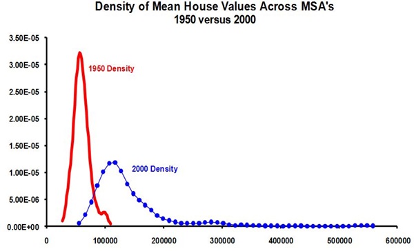
 Here's a figure, which is a version of a diagram that appears in "Superstar Cities," by Joseph Gyourko, Christopher Mayer, and  Todd Sinai in the American Economic Journal: Economic Policy, November 2013 (5:4, pp. 167-99). The figure shows what the distribution of the average house value across US metropolitan statistical areas (MSAs) in 1950 and 2000. Average prices are higher in 2000 than in 1950, which isn't surprising, since the average house is bigger, too. But the key insight here is that the distribution of average housing prices across cities in 1950 is more bunched together, while the distribution across cities in 2000 is much wider, with a long right-hand-tail.

Fig2

This wider distribution of housing prices across cities has broader trade-offs. It becomes harder for those living in cities with lower housing prices to relocate to cities with higher housing prices. It creates a greater level of economic segregation, because those with higher incomes are more likely to end up living in a smaller number of cities where they can afford the high housing prices, while those with middle-level or lower-level incomes struggle to find alternatives.  It adds a dose of bitterness to local arguments over zoning, because current owners of high-priced houses (whether they have owned a house for decades or bought more recently) live in fear that an increase in the supply of housing--or even building more moderately-sized and -price housing--might in some way limit whether their own home will keep rising in price. Gyourko says:
"I am a traditional housing and urban economist in this regard. New construction imposes real costs on its immediate neighbors and the broader community. Pollution is one, with congestion (on the roads, schools, etc.) being another. It is economically efficient to internalize these negative externalities by ‘taxing’ the developer in some way so the full costs of development are priced and paid for by the builder. What I am not in favor of is excessive regulation that imposes costs much higher than could be justified by spillovers. That results in too little development and creates affordability problems for the poor and the middle class."
In this hyperpartisan time in which we live, I feel compelled to add that the goal of rolling back local restrictions that limit house-building is advocated not just by the usual free-market suspects who tend to lean right politically, but was also supported by the Obama administration. For example, President Obama said in a speech to the US Conference of Mayors in January 2016: "We can work together to break down rules that stand in the way of building new housing and that keep families from moving to growing, dynamic cities." The Obama administration also published a "Housing Development Toolkit" (September 2016) to provide strategies for overcoming excessive local barriers to home-building.
Posted by Timothy Taylor at 8:00 AM
Email ThisBlogThis!Share to TwitterShare to FacebookShare to Pinterest

Monday, April 24, 2017

Seeking Consensus on Effects of Pre-Kindergarten Programs

When describing  how many economists at least try to think about the problems of the world, I often repeat the title of a lovely little book that Alan Blinder wrote back in 1988: Hard Heads, Soft Hearts: Tough-minded Economics For A Just Society.  In the context of expanding provision of pre-kindergarten programs, even a modest degree of soft-heartedness cries out for trying to assist small children who, through no action or fault of their own, otherwise seem likely to start school well behind their peers. But hard-headedness (and curiousity) demands that such programs be evaluated.

For a readable overview of what is actually known, rather than hoped, a useful starting point is "The Current State of Scientific Knowledgeon Pre-Kindergarten Effects" what was put together by a "Pre-Kindergarten Task Force of interdisciplinary scientists" convened by the Brookings Institution and the Duke University Center for Child and Family Policy. The participants are: "Deborah A. Phillips of Georgetown University, Mark W. Lipsey of Vanderbilt University, Kenneth A. Dodge of Duke University, Ron Haskins of the Brookings Institution, Daphna Bassok of the University of Virginia, Margaret R. Burchinal of the University of North Carolina at Chapel Hill, Greg J. Duncan of the University of California-Irvine, Mark Dynarski of the Brookings Institution, Katherine A. Magnuson of the University of Wisconsin-Madison, and Christina Weiland of the University of Michigan "

A short summary of the findings would be that a number of pre-K programs have a short-term effect in helping children be more ready for kindergarten, especially for children from disadvantaged backgrounds. But not all programs show such effects in the short-term, and whether the effects continue or fade after a few years of schooling is quite unclear. Here is their consensus statement:
"The Task Force reached consensus on the following findings, conclusions, and recommendation: 
"Studies of different groups of preschoolers often find greater improvement in learning at the end of the pre-k year for economically disadvantaged children and dual language learners than for more advantaged and English-proficient children. 
"Pre-k programs are not all equally effective. Several effectiveness factors may be at work in the most successful programs. One such factor supporting early learning is a well implemented, evidence-based curriculum. Coaching for teachers, as well as efforts to promote orderly but active classrooms, may also be helpful. 
"Children’s early learning trajectories depend on the quality of their learning experiences not only before and during their pre-k year, but also following the pre-k year. Classroom experiences early in elementary school can serve as charging stations for sustaining and amplifying pre-k learning gains. One good bet for powering up later learning is elementary school classrooms that provide individualization and differentiation in instructional content and strategies. 
"Convincing evidence shows that children attending a diverse array of state and school district pre-k programs are more ready for school at the end of their pre-k year than children who do not attend pre-k. Improvements in academic areas such as literacy and numeracy are most common; the smaller number of studies of social-emotional and self-regulatory development generally show more modest improvements in those areas. 
"Convincing evidence on the longer-term impacts of scaled-up pre-k programs on academic outcomes and school progress is sparse, precluding broad conclusions. The evidence that does exist often shows that pre-k-induced improvements in learning are detectable during elementary school, but studies also reveal null or negative longer-term impacts for some programs. 
"States have displayed considerable ingenuity in designing and implementing their pre-k programs. Ongoing innovation and evaluation are needed during and after pre-k to ensure continued improvement in creating and sustaining children’s learning gains. Research-practice partnerships are a promising way of achieving this goal. These kinds of efforts are needed to generate more complete and reliable evidence on effectiveness factors in pre-k and elementary school that generate long-run impacts. 
"In conclusion, the scientific rationale, the uniformly positive evidence of impact on kindergarten readiness, and the nascent body of ongoing inquiry about long-term impacts lead us to conclude that continued implementation of scaled-up pre-k programs is in order as long as the implementation is accompanied by rigorous evaluation of impact."
I suppose it is almost inevitable that a group of academics end up advocating additional research. The volume follows this consensus statement with a number of short and readable individual essays on various aspects of pre-K education. Here, I'll add a few thoughts of my own.

1) This summary of the state of evidence about pre-K programs is quite mainstream. Indeed, I've previously posted here and here about summaries that reached similar conclusions.

2) Some of the highest estimates of returns to pre-K education are probably not generalizable to a broader program. For example, in a short chapter on "The Costs and Benefits of Scaled-Up
Pre-Kindergarten Programs" in this volume, Lynn A. Karoly writes (footnotes omitted):
"Estimates of the high returns from investing in high-quality pre-k programs largely rest on two pre-k program impact evaluations: the Perry Preschool program where the returns based on the age-40 follow-up are estimated to be as high as 17-to-1, and the Chicago Child-Parent Centers (CPC) program, where the impact estimates as of the age-26 followup indicate returns of close to 11-to-1. The Perry Preschool program, while well known, is also acknowledged to be a small-scale demonstration program, implemented in the 1960s with exceptionally high standards and serving a highly disadvantaged population of children at a time period when children in the control condition do not have alternative pre-k options. For these reasons, the estimated returns represent more of a proof of the principle that high-quality pre-k programs can produced positive economic benefits, rather than definitive evidence of the economic returns that would be expected from scaled-up programs.
"The Chicago CPC program is arguably a scaled-up part-day program operated by the Chicago Public School district and targeted to children in low-income neighborhoods ... However, the Chicago CPC program may also be viewed as exceptional because the program evaluation focuses on a cohort of children that attended the program in the early 1980s, with impacts that may not be replicated in today’s environment."
Also, Karoly estimate the cost of a "school-day" pre-K program--that is, 6 hours per day--at about $8,000 per student: a little higher if the teachers are paid typical kindergarten wages.

3) One of the most careful and comprehensive studies of pre-K education published in 2013, evaluating the federal Head Start program, found a nearly complete fade-out of any positive effect of pre-K by third grade. The study said:
"In summary, there were initial positive impacts from having access to Head Start, but by the end of 3rd grade there were very few impacts found for either cohort in any of the four domains of cognitive, social-emotional, health and parenting practices. The few impacts that were found did not show a clear pattern of favorable or unfavorable impacts for children."
4) I have started to wonder if effective interventions for disadvantaged children need to come considerably earlier than pre-K. Some evidence suggests that for a number of disadvantaged children, the gap in their cognitive skills emerges somewhere between 9 months and two years of age. Back in 2013, Richard V. Reeves, Isabel Sawhill and Kimberley Howard described this evidence in an essay called  "The Parenting Gap," in which they pointed out that the federal government spends 25 times as much on Head Start as it does on programs targeted at parents of those same children for their first few years of life. In other work, Douuglas Almond and Janet Currie have argued that differences in cognitive abilities and other developmental measures can arise even before birth in "Killing Me Softly: The Fetal Origins Hypothesis," published in the Summer 2011 Journal of Economic Perspectives (where I work as Managing Editor). 

In short, I worry that hard-headed analysis, together with a soft-hearted concern for disadvantaged children, should be pushing us toward interventions that will assist disadvantaged children well before they are old enough for a pre-K program. 
Posted by Timothy Taylor at 8:00 AM
Email ThisBlogThis!Share to TwitterShare to FacebookShare to Pinterest

Friday, April 21, 2017

Don't Fear the (McCormick) Reaper

The McCormick reaper is one of the primary labor-saving inventions of the early 19th century, and at a time when many people are expressing concerns about how modern machines are going to make large numbers of workers obsolete, it's a story with some lessons worth remembering. Karl Rhodes tells the story of the arguments over who invented the reaper and the wars over patent rights in  "Reaping the Benefits of the Reaper," which appears in the Econ Focus magazine published by the Federal Reserve Bank of Richmond (Third/Fourth Quarter 2016, pp. 27-30). Here, I'll lay out some of the lessons which caught my eye, which in places will sound similar to modern issues concerning innovation and intellectual property.

The reaper was important, but it didn't win the Civil War

The reaper was a horse-drawn contraption for harvesting wheat and other grains. Rhodes quotes the historian William Hutchinson who wrote: "Of all the inventions during the first half of the nineteenth century which revolutionized agriculture, the reaper was probably the most important," because it removed the bottleneck of needing to hire lots of extra workers at harvest time, and thus allowed a farmer "to reap as much as he could sow."

But somewhere along the way, I had imbibed a larger myth, that the labor saving properties of the reaper helped the North to with the Civil War by allowing young men who would otherwise have been needed for the harvest to become soldiers. However, Daniel Peter Ott in a 2014 PhD dissertation on " Producing a Past: Cyrus McCormick's Reaper from Heritage to History." Ott traces the claim that the reaper helped to win the Civil War back to some  promotional materials for the centennial celebration of the reaper in 1931 produced by International Harvester which included this statement:
"Secretary of War Stanton said: ‘The reaper is to the North what slavery is to the South. By taking the place of regiments of young men in western harvest fields, it released them to do battle for the Union at the front and at the same time kept up the supply of bread for the nation and the nation’s armies. Thus, without McCormick’s invention I feel the North could not win and the Union would have been dismembered.’"
Ott argues persuasively that this quotation is incorrect. Apparently, Edwin Stanton was a patent attorney before he became Secretary of War for President Lincoln, and he was arguing in court in 1861 that McCormick's reaper deserved an extension of his patent term. Ott quotes a 1905 biography of Edwin Stanton, written by Frank A. Flower, which included the following quotation attributed to an 1861 patent case, in which Stanton argued:
"The reaper is as important to the North as slavery to the South. It takes the place of the regiments of young men who have left the harvest fields to do battle for the Union, and thus enables the farmers to keep up the supply of bread for the nation and its armies. McCormick’s invention will aid materially to prevent the Union from dismemberment, and to grant his prayer herein is the smallest compensation the Government can make."
There doesn't seem to be any documentary evidence directly from the 1860s on what Stanton said. But it appears plausible that the he argued as a patent attorney in 1861 that the McCormick reaper deserved a patent because it could help to with the Civil War, and that comment was later transmuted by a corporate public relations department into a claim that Secretary of War Stanton credited the reaper with actually winning the Civil War.

New innovations can bring conflict over intellectual property

Oded Hussey patented a reaper in 1833. Cyrus McCormick patented a reaper in 1834. By the early 1840s, Hussey had sold more reapers than McCormick. But the idea of a mechanical reaper had been in the air for some time. Joseph Gies offered some background in "The Great Reaper War," published in the Winter 1990 issue of Invention & Technology.  Gies wrote:
"In 1783 Britain’s Society for the Encouragement of Arts, Manufactures, and Commerce offered a gold medal for a practical reaper. The idea seemed simple: to use traction, via suitable gearing, to provide power to move some form of cutting mechanism. By 1831 several techniques had been explored, using a revolving reel of blades, as in a hand lawn mower; a rotating knifeedged disk, as in a modern power mower; and mechanical scissors. Robert McCormick had tried using revolving beaters to press the stalks against stationary knives. Cyrus McCormick and Obed Hussey both chose a toothed sickle bar that moved back and forth horizontally. Hussey’s machine was supported on two wheels, McCormick’s on a single broad main wheel, whose rotation imparted motion to the cutter bar. Wire fingers or guards in front of the blade helped hold the brittle stalks upright."
Hussey and McCormick then both argued in 1848 for their patent rights to be extended for a first time. By 1861, at the time patent attorney Stanton made his comments about the importance of the reaper, Hussey's patent rights had been extended for a third time, and McCormick wanted his patent rights extended, too. Indeed, the New York Times editorialized on July 6, 1860, against giving McCormick another extension of the patent, writing: 
"A few words in reply to the Tribune-McCormick "facts," which are assumed to justify the proposed extension. The first two of these may be summed up as follows: The patentee failed to secure extensions of his first two patents -- and, therefore, his original invention and improvements covered by his first and second patents are free by all mankind Granted; and we claim that for the precise reasons which led to the rejection of his petitions for the extension of his original patents, his now pending petition should be treated in the same manner. Those reasons were that the "improvements" are non-essential, and that the patentee has received ample remuneration for his invention.
But, says Mr. MCCORMICK, "OBED HUSSEY obtained an extension of his patent, and therefore mine should also be extended." Two wrongs never yet made one right; and it was the fact that HUSSEY's patent was renewed by the late acting Commissioner, unjustifiably, which, more than anything else, induced Congress to take the McCormick case out of his hands. The public were wronged in the Hussey case; and it is therefore still more incumbent upon the Patent Office to see to it that another wrong is not added to the list. ... It is notorious that MCCORMICK will have made over $2,000,000 on his reapers by the time his present patents shall have expired, and as the new Commissioner of Patents has a reputation for honesty to maintain, there is little danger that the monopoly will be renewed." 
Indeed, the arguments over reaper patents from the 1840s up into the early 1860s were some of the early battles in what is sometimes called "the first patent litigation explosion." One early result was that the Patent Act of 1861 removed the discretionary power of the Patent Office to extent patents by seven years at a time, and instead created the 17-year patent term. 


Innovations can take decades before coming into widespread use 

Although versions of the reaper were patented in the first half  of the 1830s, they didn't come into widespread use until the 1850s and later. Why not? A body of research in economic history tackled that question several decades ago, and Rhodes provides a nice compact summary of how thinking on this question evolved:
The traditional explanation for this surge in sales was the rapid rise of global wheat prices during the Crimean War, which limited grain exports from Russia and other nations in the Black Sea region. But in the 1960s, Stanford University economist Paul David offered another primary explanation: He argued that before the mid-1850s, most American farms were simply too small to make reapers practical.
The average farm size was growing, however, as grain production shifted from the East to the Midwest, where arable land was fresh, fertile, and relatively flat. More importantly, the farm-size threshold for the reaper to be practical was declining as the price of labor — relative to the price of reaping machines — increased in the Midwest due to higher demand for workers to build railroads and other infrastructure throughout the fast-growing region, David wrote.
In the 1970s, Alan Olmstead, an economist at the University of California, Davis, agreed that factor prices and farm sizes were important, but he argued that ... [f]armers often cooperated to use reapers on multiple farms, a possibility that David had excluded from his model. Olmstead also faulted David for assuming that there were no significant advances in reaper technology between 1833 and the 1870s. This assumption that the reaper was born fully developed grew into a "historical fact," Olmstead wrote, even though it ignored "extremely knowledgeable historians who emphasized how a host of technological changes transformed an experimentally crude, heavy, unwieldy, and unreliable prototype of the 1830s into the relatively finely engineered machinery of the 1860s."
For those who would like to go back to original sources, Paul David's article was "The Mechanization of Reaping in the Ante-Bellum Midwest," published in a 1966 volume edited by Henry Rosovsky, , Industrialization in Two Systems: Essays in Honor of Alexander Gerschenkron,  pp. 3-39.  Alan L. Olmstead's essay is "The Mechanization of Reaping and Mowing in American Agriculture, 1833-1870," in the June 1975 issue of the Journal of Economic History,  pp. 327-352.

The slow diffusion of technology is a widespread finding: for example, I've posted on this blog about the examples of tractors and dynamo-generated electrical power in  "When Technology Spreads Slowly" (April 14, 2014).  It's a useful warning and reminder to those who seem to believe, often implicitly, that the internet and data revolution is pretty much over at this point, and we've seen pretty much all the changes we're going to see.

Entrepreneurship isn't just about technology, but also needs marketing, manufacturing, and continual improvement

Why is the reaper often known in the history books as the "McCormick reaper," when Hussey patented first. The answer from shows up in the subtitles of articles. For example, Rhodes subtitles his article: "Cyrus McCormick may not have invented the reaper, but he was the entrepreneur who made it successful." Similarly, Gies writes in the subtitle of his 1990 article: Cyrus McCormick won it—his famed Virginia reaper came to dominate America’s harvests—but he didn’t win by building the first reaper or, initially, the best."

But McCormick shows a persistent entrepreneurial drive. He moved to Chicago, so that his reapers would have better access to markets in the midwest and west, leaving the eastern market to Hussey. He continually improved the reaper. He pushed ahead on manufacturing and marketing.  Rhodes writes:

But based on overlapping information from sources cited by both sides of the family, it seems likely that Cyrus and Robert both contributed to the McCormick reaper of 1831. And so did their slave, Jo Anderson, and so did a local blacksmith, John McCown. It also seems possible that Cyrus and Robert obtained knowledge of previous attempts to develop a practical reaper. ,,, [But]  who supplied the entrepreneurial power that brought the reaper into common use? And the answer is clearly Cyrus McCormick."

P.S. For those who find the title of this post perplexing, it's a reference to a 1976 song by Blue Oyster Cult called "(Don't Fear) The Reaper." It led to a classic Saturday Night Live skit in which the band is encouraged to play the song with "more cowbell."


Posted by Timothy Taylor at 10:18 AM
Email ThisBlogThis!Share to TwitterShare to FacebookShare to Pinterest

Wednesday, April 19, 2017

Personnel is Policy: Presidential Appointments

There are over 1,200 positions in the US government (not counting judges or military appointments) that require the US Senate to confirm a candidate nominated by the president. (These are a subset of about 3,700 positions that require the president to appoint someone, but most of the positions in this broader group don't require Senate confirmation.) Often, the people appointed to these positions have a reasonable degree of day-to-day discretion in decision-making: in that sense, as those inside the DC beltway like to say, "personnel is policy.: As President Trump pushes ahead with his proposed appointments, what is the historical record of success for such appointments in the US Senate? Anne Joseph O’Connell compiles the evidence in "Staffing federal agencies: Lessons from 1981-2016," a report written for the Brookings Institution (April 17, 2017).

Here's a figure showing the success rate of presidential appointments in receiving Senate confirmation going back to the 97th Congress, during the 1981-82 at the start of President Reagan's first term.
Executive Branch Failure Rates Transparent

I'll mostly leave it to readers to sort through the years and whether the president was facing a Senate of the same party. But a few points seem worth noting: 

1) It's common for presidents to have 20% or more of their nominees not make it through Senate confirmation, especially later in presidential terms. 

2) The share of presidential nominees not making it through US Senate confirmation has been rising over time, and for President Obama, 30% of his nominees didn't make it through the Senate. 


3) Perhaps unexpectedly, the share of President Obama's nominees who didn't make it through the Senate was only a bit higher during his last two years in 2015-2016, when Republicans controlled the Senate, than it was during 2013-2014, when Democrats controlled the Senate. Moreover, remember that in November 2013, the Democrats running the US Senate changed the rules so that it was no longer possible to filibuster presidential appointees. But as O'Connell points out: 
"Failure rates, however, increased for free-standing executive agencies, within and outside the Executive Office of the President, and for national councils. More surprisingly, confirmation delays for agency nominations increased across the board. For those successful 2013 nominations (a few of which were actually confirmed in December after the change), they took 95 days, on average. In 2014, delays ballooned to 150 days. Indeed, it was the biggest jump in any given year in an administration between any two presidents."
4) O'Connell also makes the interesting point that often about 15-20% of these theoretically appointed positions, or more, are not filled at any given time over the years. She writes that President Obama appointed fewer people, and as a result ended up leaving positions open more often. 
"Interestingly, President Obama submitted fewer nominations (2828) than any of the other two-term presidents. President George W. Bush submitted the highest (3459); Presidents Reagan and Clinton each submitted around 3000 (2929 and 3014, respectively).... President Obama submitted fewer nominations than his predecessors, allowing acting officials to fill in for many important positions. President Trump could follow suit."
My own sense is that far too many low-level nominations are held up for dubious and extraneous reasons by individual or small groups of senators. For example, late in the Obama administration the board that is supposed to oversee the US Postal Service had zero members out of the nine possible appointments. The reported reason is that Senator Bernie Sanders put a hold on all possible appointees, as a show of solidarity with postal workers. If it isn't obvious to you how Sanders preventing President Obama from appointing new board members would influence the US Postal Service in the directions that Sanders would prefer, given that President Trump could presumably appoint all nine members of the board, you are not alone. 

This system of 1,200-plus presidential appointments requiring Senate approval seems dysfunctional but that doesn't alter the reality that these 1,200-plus appointments are among the most important steps a president can make. 
Posted by Timothy Taylor at 8:00 AM
Email ThisBlogThis!Share to TwitterShare to FacebookShare to Pinterest

Tuesday, April 18, 2017

Characteristics of US Minimum Wage Workers

As a factual backdrop for the ongoing arguments about whether or how much to raise the minimum wage, a useful starting point is the most recent version of the annual report from the US Bureau of Labor Statistics on "Characteristics of Minimum Wage Workers, 2016" (published April 2017). It begins:
"In 2016, 79.9 million workers age 16 and older in the United States were paid at hourly rates, representing 58.7 percent of all wage and salary workers. Among those paid by the hour, 701,000 workers earned exactly the prevailing federal minimum wage of $7.25 per hour. About 1.5 million had wages below the federal minimum. Together, these 2.2 million workers with wages at or below the federal minimum made up 2.7 percent of all hourly paid workers. The percentage of hourly paid workers earning the prevailing federal minimum wage or less declined from 3.3 percent in 2015 to 2.7 percent in 2016. This remains well below the percentage of 13.4 recorded in 1979, when data were first collected on a regular basis ..." 
The report is mostly a series of tables, which the interested reader will want to pick through. Here are some highlights from the 2016 data as selected by BLS (parenthetical references to specific supporting tables omitted):
Age. Minimum wage workers tend to be young. Although workers under age 25 represented only about one-fifth of hourly paid workers, they made up about half of those paid the federal minimum wage or less. Among employed teenagers (ages 16 to 19) paid by the hour, about 10 percent earned the minimum wage or less, compared with about 2 percent of workers age 25 and older.  ... 
Education. Among hourly paid workers age 16 and older, about 5 percent of those without a high school diploma earned the federal minimum wage or less, compared with about 3 percent of those who had a high school diploma (with no college), 3 percent of those with some college or an associate degree, and about 2 percent of college graduates. ... 
Full- and part-time status. About 6 percent of part-time workers (persons who usually work fewer than 35 hours per week) were paid the federal minimum wage or less, compared with about 2 percent of full-time workers. 
Occupation. Among major occupational groups, the highest percentage of hourly paid workers earning at or below the federal minimum wage was in service occupations, at about 7 percent. Two-thirds of workers earning the minimum wage or less in 2016 were employed in service occupations, mostly in food preparation and serving related jobs.
Industry. The industry with the highest percentage of workers earning hourly wages at or below the federal minimum wage was leisure and hospitality (about 13 percent). Three-fifths of all workers paid at or below the federal minimum wage were employed in this industry, almost entirely in restaurants and other food services. For many of these workers, tips may supplement the hourly wages received. 
State of residence. The states with the highest percentages of hourly paid workers earning at or below the federal minimum wage were Idaho, Kentucky, Louisiana, Mississippi, and South Carolina (all were at or about 5 percent). The states with the lowest percentages of hourly paid workers earning at or below the federal minimum wage were in the West: Alaska, California, and Oregon (all were 1 percent or less). It should be noted that many states have minimum wage laws establishing standards that exceed the federal minimum wage.
I was also struck by this regional breakdown: of those being paid at or below the federal minimum wage in 2016, 48.5% lived in the South, 21.6% in the Midwest, 16.7% in the Northeast, and 13.3% in the West. The report doesn't have a breakdown of  minimum wage workers by urban and nonurban areas, but I suspect those differences would be fairly large, too.

As long as we're laying down a fact base, here are a few figures, Here are the share of hourly workers (that is, not all workers, but that proportion of workers paid hourly) who receive the minimum wage, from the FRED website run by the Federal Reserve Bank of St. Louis: 


And here are  a couple of figures put together earlier this year by Drew DeSilver of Pew Research in a short report called "5 facts about the the minimum wage" (January 4, 2017). Here's a state map and a list of state minimum wages giving a sense of which states have a higher state-level minimum wage, and the level of those minimum wages.

Finally, here's a figure from DeSilver showing the evolution of the nominal and real federal minimum wage over time. 

I'm of course well aware that few people will dramatically alter their opinion about the minimum wage based on these kinds of facts.

For example, some will look at the variation across states in minimum wage levels and see it as a sest of differences that are appropriate given the differences in wages and political values across the US states; others will see the difference as a reason the federal government needs to step in and raise minimum wages in states that have been reluctant to do so. As another example, some will look at the figure showing that 2.7% of hourly workers are paid the minimum wage, with the majority of the the "leisure and hospitality" industry like restaurants and food services, and view that as an argument that there's not much reason to raise the minimum wage ("a raise would affect only a narrow slice of workers, most of them young and in food service") while others will look at the same data and view it as a strong justification for  a substantially higher minimum wage ("the low share of hourly workers receiving the hourly minimum wage means it is overdue for a raise").

Still, having an agreed-upon fact base may at least set boundaries of realism that rule out some of the more extreme claims, and in that way help to  focus the arguments. 
Posted by Timothy Taylor at 8:00 AM
Email ThisBlogThis!Share to TwitterShare to FacebookShare to Pinterest

Saturday, April 15, 2017

The Economics of Horseshoe Crab Blood

When global demand for a natural product that reproduces only slowly skyrockets, it can be an extinction or near-extinction event. A classic example is how global demand for buffalo hide nearly wiped out the North American bison. Caren Chesler reports an in-progress story about "The Blood of the Horseshoe Crab" in Popular Mechanics (April 13, 2017). The subtitle of the story reads: "Horseshoe crab blood is an irreplaceable medical marvel—and so biomedical companies are bleeding 500,000 every year. Can this creature that's been around since the dinosaurs be saved?"

The situation makes a nice vivid modern example of the "tragedy of the commons," in which private actors driven by their own incentives overuse a common resource until everyone suffers as a result. 
Here's a sampling of Chesler's argument, but the article itself is very much worth reading:
The cost of crab blood has been quoted as high as $14,000 per quart. Their distinctive blue blood is used to detect dangerous Gram-negative bacteria such as E. coli in injectable drugs such as insulin, implantable medical devices such as knee replacements, and hospital instruments such as scalpels and IVs. Components of this crab blood have a unique and invaluable talent for finding infection, and that has driven up an insatiable demand. ... There are currently no quotas on how many crabs one can bleed because biomedical laboratories drain only a third of the crab's blood, then put them back into the water, alive. But no one really knows what happens to the crabs once they're slipped back into the sea. Do they survive? Are they ever the same? ... 
While industry experts say the $14,000-a-quart estimate is high—the figure is more likely the price tag for the coveted amoebocytes that are extracted from the blood—it is testament to how precious LAL [Limulus Amoebocyte Lysatehas] become. To make enough of it for LAL testing, the biomedical industry now bleeds about 500,000 crabs a year. Global pharmaceutical markets are expected to grow as much as 8 percent over the next year. ...
The International Union for Conservation of Nature, which sets global standards for species extinction, created a horseshoe crab subcommittee in 2012 to monitor the issue. The group decided last year that the American horseshoe crab is "vulnerable" to extinction ... "Vulnerable" is just one notch below "endangered," after all. Furthermore, the report said crab populations could fall 30 percent over the next 40 years. (This risk varies by region. While populations are increasing in the Southeast and stable in the Delaware Bay, spawning in the Gulf of Maine is no longer happening at some historic locations and the population continues to decline in New England, largely because of overharvesting.) ... The Atlantic States Marine Fisheries Commission (ASMFC), which manages the fishery resources along the Atlantic coast, has harvest quotas in place on bait fishermen who use horseshoe crabs to catch eels and conch. But not for biomedical laboratories. They can take as many crabs as they like, and that harvest continues to grow. The number of crabs harvested by the U.S. biomedical industry jumped from an estimated 200,000 to 250,000 in the 1990s to more than 610,000 crabs in 2012, according to the ASMFC's latest stock assessment report. ...

The same story plays out across the Pacific Ocean. The horseshoe crab native to Asia, called Tachypleus, produces a different but equally useful version of LAL called Tachypleus Amoebocyte Lysate, or TAL. But horseshoe crabs are already disappearing from beaches in China, Japan, Singapore, Taiwan, and Hong Kong, places where they once thrived. ...

If the species were to dwindle, it wouldn't just be an issue for conservationists but for everyone, as LAL is currently the only substance able to detect gamma-negative bacteria in the health field. As one conservationist put it, "Every man, woman, and child and domestic animal on this planet that uses medical services is connected to the horseshoe crab."
My ignorance of horseshoe crab physiology and ecology is deep and profound, so maybe the environmental concerns here will turn out to be overblown. Also, in this age of genetics and biotechnology, it seems implausible to me that scientists can't eventually find a substitute for the blood of horseshoe crabs! But as long as the blood of horseshoe crabs remains relatively cheap, spending money for research on substitutes doesn't look profitable.  
Posted by Timothy Taylor at 9:00 AM
Email ThisBlogThis!Share to TwitterShare to FacebookShare to Pinterest

Friday, April 14, 2017

Julian Simon's "Almost Practical Solution to Airline Overbooking"

As the topic of passengers being hauled off of airplanes hits the headlines, spare a moment to remember how an economist pioneered the idea that if you had a ticket, and the airline wanted to bump you off the flight, the company needed to hold an auction and offer compensation to find a passenger willing to stay back.

It's been almost a half-century since Julian Simon wrote "An Almost Practical Solution to Airline Overbooking," which was a two-page note in the May 1968 Journal of Transport Economics and Policy (pp. 201-2). Here's how Simon described the idea in 1968:
Perhaps the reader has suffered a fit of impotent rage at being told that he could not board an aeroplane for which he held a valid ticket. The explanation is clear, and no angry letter to the president of the airline will rectify the mistake, for mistake it was not. The airline gambles on a certain number of cancellations, and therefore sometimes sells more tickets than there are seats. Naturally there are sometimes more seat claimants than seats.
The solution is simple. All that need happen when there is overbooking is that an airline agent distributes among the ticket-holders an envelope and a bid form, instructing each person to write down the lowest sum of money he is willing to accept in return for waiting for the next flight. The lowest bidder is paid in cash and given a ticket for the next flight. All other passengers board the plane and complete the flight to their destination.
All parties benefit, and no party loses. All passengers either complete their flight or are recompensed by a sum which they value more than the immediate completion of the flight. And the airlines could also gain, because they would be able to overbook to a higher degree than at present, and hence fly their planes closer to seat capacity. ...
But of course this scheme will not be taken up by the airlines. Why? Their first response will probably be "The administrative difficulties would be too great". The reader may judge this for himself. Next they will suggest that the scheme will not increase net revenue. But the a priori arguments to the contrary make the scheme worth a trial, and the trial would cost practically nothing and would require no commitment.
What are the real reasons why this scheme will not be adopted? Probably that "It just isn't done", because such an auction does not seem decorous; it smacks of the pushcart rather than the one price store; it is "embarrassing" and "crass", i.e., frankly commercial, like "being in trade" in Victorian England.
Simon's idea seemed a little ridiculous to a number of commentators back in 1968, the sort of hypothetical, unworldly, and impractical idea that only an economist could favor. After being enacted and around for a few decades, of course, it now seems obvious. In the classroom, it's a nice practical real-world example of what is arguably a Pareto gain.

As Cass Sunstein and others have recently written, the obvious solution to the overbooking problem--at least if you are thinking like an economist--is to change the regulations that limit how much airlines are allowed to pay so that a few passengers can take a later flight. Of course, airlines dislike the idea. When Simon asked why the scheme wouldn't be adopted in the first place, he left out one reason: "The airline already has the money you paid for a ticket, and don't want to return any of it to you if at all possible." But there's a social and political tradeoff here: if airlines want to keep having the freedom to overbook their flights, then they need to face the reality of paying a compensation level so that when a few ticketed passengers can't be accommodated on a given flight, those passengers are willing to postpone their flight voluntarily.

Posted by Timothy Taylor at 2:00 PM
Email ThisBlogThis!Share to TwitterShare to FacebookShare to Pinterest

A Truckload of Tips for Teaching Economics

Back in 1990, William McEachern started editing a semiannual newsletter that he called "The Teaching Economist." Each issue had a handful of pithy article, with a heavy emphasis on concrete suggestions linked to actual experience. After 26 years and 52 issues, McEachern has decided to that the Spring 2017 issue, #52, will be the last. However, all the past newsletters are freely available online, and they offer many nuggets for teachers willing to mine the archives. 

For his work as a teacher and textbook author, as well as in editing "The Teaching Economist," McEachern has earned the right to offer some lessons and myths. Here they are:
Students learn by organizing new information into a coherent mental structure, integrating that with their prior knowledge and experience, then retrieving that information repeatedly from memory. Here are four key findings from cognitive science.

Finding # 1: Students are much more likely to recall information that relates somehow to what they already know or have experienced. Spell out how new material relates to existing knowledge or experience. Use examples from student life, current events, and popular culture. Ask students to generate their own examples from personal experience. All this makes new material more memorable.

Finding # 2: The key to long-term learning is practicing retrieval. Many experiments have found that learning improves when students actively retrieve information from memory rather than passively reread class notes or textbooks. Information that’s actively retrieved thereby becomes more accessible in the future and is therefore more transferable to other situations.

Finding # 3: Raise key ideas again and again over time. Retrieval and testing sessions that are spaced out over time are effective for long-term retention and transfer. The long-term benefits of spacing retrieval over time have been found for more than a century of controlled research into human memory. Teachers should align their presentations, assignments, and tests so that key ideas are recalled frequently throughout the term. And students should space their retrieval sessions over time.

Finding # 4: “Desirable difficulties” foster engagement, which helps students learn. Desirable difficulties are challenges introduced during instruction that seem to benefit long-term learning, challenges such as presenting material in different contexts and in different formats. Desirable difficulties may seem to slow the apparent rate of learning in the short run, but they boost long-term retention and transfer. Presentations that challenge students engage them more, and this helps them learn.
And Four Myths

Although cognitive scientists have been studying teaching and learning for decades, not many teachers and fewer students rely on this research even second or third hand. Some teaching and learning practices have no empirical support— they are simply myths. Here are four.

Myths# 1: The mind works like a memory machine. Students believe they sit in class and soak up the knowledge. They read a chapter and absorb the material; they read it again and encode it. The very familiarity of a second reading persuades them that they know the stuff. But test results tell them otherwise. Instead, new information enters long-term memory only if linked to what’s already known, then retrieved repeatedly over time.

Myth# 2: Testing is not learning but is a mere yardstick to measure how much has been learned. Most students don’t like taking tests and most instructors don’t like preparing, administering, and grading them. So testing is usually not a valued activity in itself. Tests, however, are forced retrieval, and this helps students learn and remember. Dozens of studies demonstrate the power of testing as a learning tool, particularly in pointing out weaknesses. Frequent, low-stakes, classroom quizzes may be one of the best ways you can help students learn new material.

Myth# 3: Learning depends on a student’s learning style. According to this myth, some students learn visually, others by hearing, others by reading, and so on. Each student’s brain is a lock that’s accessed only with the right key, the right learning style. Although some students seem to have preferences about how they learn, there is no evidence that customizing instruction to match a student's preferred learning style leads to better achievement. Because interest flows from variety, instructors should offer material using a mix of learning styles.

Myth # 4: Your classroom presentation determines how much students learn.What you do in class matters less than what you ask and expect students to do in your course. Student effort determines how much is learned, how well it's remembered, and under what conditions it's recalled and applied to new situations. Remember, it’s less what you teach and more what students do for themselves to learn.
Posted by Timothy Taylor at 11:28 AM
Email ThisBlogThis!Share to TwitterShare to FacebookShare to Pinterest

Wednesday, April 12, 2017

US Polling on Attitudes Toward Trade

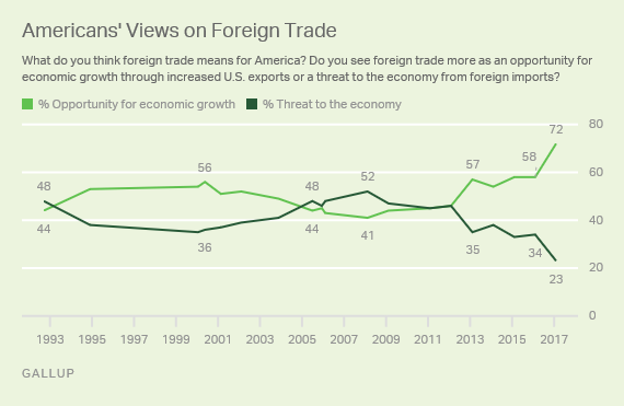
The Gallup organization has been asking for almost 25 years: "What do you think foreign trade means for America? Do you see foreign trade more as an opportunity for growth through increased U.S. exports or as a threat to the economy from foreign imports?" As I've written before about this poll: "I do need to add in passing that pretty much all economists would view the specific Gallup question, which assumes that exports benefit the US economy and imports threaten it, as a fundamentally wrong-headed view of why an economy benefits from trade." But that said, the results suggest that the low point for attitudes toward trade was during the Great Recession and its aftermath, and since about 2013, more and more people are seeing trade as "opportunity" rather than "threat."

Here's the overall pattern from Gallup based on February 2017 polling:

Graph 1

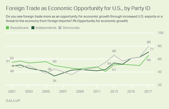
And here's the breakdown by political affiliation:

Graph 2

Poll results are always open to interpretation, and this is obviously no exception. For example, it's possible that anti-Trump forces are rallying to the defense of trade because it seems to them imperiled under the Trump administration. It's also possible that pro-Trump forces are rallying to the defense of trade because they believe that the Trump administration will be cutting much more advantageous trade deals, so that unlike in the past, trade can now help the US economy.

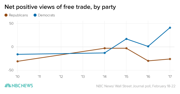
There's also a an NBC News/ Wall Street Journal poll about attitudes toward trade, which asks respondents whether they believe that free trade helps or hurts the country. Here's a figure from the NBC reporting on the poll:


How does one interpret this? The NBC story notes the swing since 2010:
"Looking back to 2010, many Democrats didn't sound unlike their Republican counterparts on the subject of free trade. An NBC News/ Wall Street Journal poll taken that year showed that just 21 percent of Republicans and 27 percent of Democrats thought that free trade helped the country. Fifty-two percent of Republicans and 43 percent of Democrats considered it harmful.  Fast-forward to 2017, and a whopping 57 percent of Democrats say they root for free trade policies, while just 16 percent say that they are harmful. Meanwhile, Republicans, after a burst of comparatively pro-trade sentiment in 2014 and 2015, are back to their 2010 levels." 
Overall, as the Wall Street Journal article on this poll notes, "The poll this month showed the highest portion of Americans who said free trade helped more than hurt since the Journal/NBC News pollsters started asking that question in 1999." In that sense, the findings from the Gallup and NBC/WSJ surveys are congruent with each other, despite the different wording. 

But these survey results may also suggest that US opinions about trade are just not very deeply rooted, and are more expressions of transient emotions and political partisanship. After all, for anyone who was watching either Democrats or Republicans during the presidential primaries, it's not obvious that there was a large supply of latent support for trade. The Wall Street Journal report on the NBC/WSJ survey included this comment: "Essentially what this says is how partisan the world is," said Peter Hart, a Democratic pollster who worked on the survey. "If Trump says the world is flat, the Democrats are going to say it's round."

Finally, it's worth a reminder that the US public attitude toward trade are considerably less positive than those in many other countries around the world. For example, here's a table from the IMF, World Bank, and World Trade Organization report, "Making Trade an Engine of Growth for All: The Case for Trade and for Policies to Facilitate Adjustment"  (March 2017), which I discussed in yesterday's post. The share of Americans who think trade is good is lower than in most advanced economies, and most emerging market and developing economies, too. This international pattern has always struck me as little odd, given that trade represents a relatively small share of the US economy--given the huge size of the US domestic market--and a relatively larger share of GDP for most of these other countries.


Posted by Timothy Taylor at 8:00 AM
Email ThisBlogThis!Share to TwitterShare to FacebookShare to Pinterest

Tuesday, April 11, 2017

Addressing Dislocation Costs of Trade: IMF, WTO, WB Weigh In

International trade disrupts the economic patterns that would otherwise exist, and both the benefits and costs of trade flow from such disruptions. The IMF, World Bank, and World Trade Organization have come together to write "Making Trade an Engine of Growth for All: The Case for Trade and for Policies to Facilitate Adjustment," which was published for an international meeting held March 22-23 in Germany.

A lot of the report is about gains from trade, public attitudes toward trade, size of barriers to trade, and possibilities for reducing barriers to trade through negotiations. Here, I'll focus on some points related to the costs of trade disruption and potential policies to address it.

Patterns of global trade in manufacturing have changed substantially since the 1990s. This figure shows that in from 1990-94, 63% of all merchandise trade as between advanced economies. By the 2010-2015 time period, this had dropped to 38%, while 45% of merchandise trade was between advanced economies (AE) and "emerging markets and developing economies" (EMDE), and the remaining 17% was between emerging market and developing economies.

The share of GDP related to manufacturing shifted during this time as well, but perhaps it wasn't always advanced economist that saw declines nor always emerging market and developing economies that saw raises. For example this figure shows that the manufacturing share of GDP decline in the US from 1995-2014, but the decline was smaller than in Canada or the UK--and Germany saw an increase in manufacturing as a share of GDP. Among the emerging market and developing economies, China saw a rise in manufacturing as a share of GDP during this time, algon with Thailand, Vietnam, and Poland, but Brazil and South Africa (abbreviated ZAF) saw declines in manufacturing as a share of GDP during this time.

The report notes that the freedome to import from the world economy is a benefit to consumers: in particular, cheap imports are a huge benefit for those with lower incomes. The report offers a figure drawn from a recent paper by Pablo D. Fajgelbaum and Amit K. Khandelwal, "Measuring the Unequal Gains from Trade," Quarterly Journal of Economics, 2016, 131: 3, pp. 1113-1180. The horizontal axis shows how much the real income (that is, the buying power of income) would fall without trade for the lowest decile by income, while the vertical axis shows how much the real income of the top decile would fall. As the graph shows, for all 40 countries in the study, the loss of income for the poor would be greater than for the rich: for example, in the US cutting off trade would reduce the real income of the bottom decile by almost 70%, but of the top decile by less than 5%. 


However, trade can also disrupt jobs. The discussion of the report on this point isn't extensive, but here are a few snippets (footnotes omitted for readability):
"According to simulation exercises, adjustment frictions in AEs [advanced economies] can lead to transition periods of up to 10 years and reduce the gains from trade by up to 30 percent (Artuç and others, 2013, Dix-Carneiro, 2014). ...  
"An unusual period of sharply increased import competition that began around 2000, along with other factors, appears to have negatively impacted regional labor markets in some AEs. Evidence on most episodes of trade increases suggests that the impact on aggregate labor market outcomes has been mild. When EMDEs [emerging market and developing economies] began to play a greater role in global manufacturing trade, in part reflecting the impact of pro-market reforms in China, a series of studies examined the impact on local labor markets during that period (Autor and others, 2016; Pierce and Schott, 2016a). These studies show that areas more exposed to competition from Chinese manufactures due to their industrial structure saw significant and persistent losses in jobs and earnings, falling most heavily on low-skilled workers. ...
"When switching industries within manufacturing, workers in developed countries have been estimated to forego in terms of lifetime income the equivalent of 2.76 times their annual wage (Artuç and others, 2015). Switching occupations may have similar costs, although these costs vary substantially across occupations and skill levels, with college-educated workers experiencing on average lower costs (Artuç and McLaren, 2015)."

What policies are likely to be most useful for workers dislocated by trade? As the report notes, many of the policies help workers dislocated by trade are the same policies that will help an economy overall to be growing and vibrant. After all, a dynamic and evolving market economy will always experience a churning labor market, with some people losing jobs or leaving jobs and others finding new jobs. Sometimes trade will be the reason, but it can also occur when a suffers domestic competition, or because it falls behind the new technological trends, or because it's poorly managed, or because it misses a shift in consumer tastes.

But going beyond broadly sensible economic policies, are there more focused particular policies that might help adjustment? It's common to discuss "passive" labor market policies like unemployment insurance or early retirement, and to draw a contrast with "active" labor market policies like job search assistance, retraining, incentives for private-sector hiring, and public employment. What's striking from an American perspective is that the US does relatively little of either one compared with many higher-income countries. In this figure the US is the third set of bars from the bottom, just above Chile and Mexico.


The report describes active labor market policies this way: "Generally, displaced workers are required to participate in interviews with employment counselors, apply for identified job vacancies, formulate individual action plans, accept offers of suitable work, and attend training programs if deemed necessary. A recent OECD study found that these activation strategies helped increase re-employment rates, especially in the case of those that are hard-to-place and the long-term unemployed, as may be the case with trade-displaced workers ,,,"

There are a variety of other recommendations, all hedged about with concerns about appropriate design and administration. For example, job training can work well, but it tends to work better if if is closely connected to an actual job, or even on-the-job training. "Housing policies may be necessary to facilitate geographical mobility." "Credit policies can facilitate the overall adjustment process." "`Place-based' policies can help revive economic activity in harder-hit regions."

The report seems still more hesitant about the potential tradeoffs from employment protection and higher minimum wage policies:

"Other aspects of labor-market policies, like employment protection and minimum wage legislation, could be revisited. While employment protection legislation can reduce displacements, it can also impede the needed reallocation. There is broad consensus that employment protection should be limited, and that low hiring/firing costs coupled with protection through unemployment benefits is preferable, as in the case of Nordic countries (Annex E on Denmark). Similarly, minimum wage policies can protect low-skilled workers from exploitation and ensure that they earn a basic level of income (Blanchard and others, 2013).34 However, the policies will need to be designed carefully to avoid potentially negative employment and efficiency effects. An overly high minimum wage, coupled with high payroll taxes, can hinder employment prospects of vulnerable groups (OECD, 2006)."
What about policies targeted in particular at those who have lost their jobs specifically because of import competition, not for other reasons?
"Well-designed and targeted trade-specific support programs can complement existing labor-market programs. ... The effectiveness of these trade-specific programs has been mixed, however, and their coverage and size tends to be very small."
From a US perspective, my own sense is that the US economy should do considerably more in the area of active labor market policies, retraining, and encouraging mobility, and should be experimenting with other local and regional programs. But the reason for these policies isn't primarily about trade. in the US economy, the dislocations from technology and domestic competition are  considerably bigger than the dislocations from trade. Greater mobility and flexibility across the labor market should tend to benefit all employees, whether they are switching jobs by choice or involuntarily.

Afterword: The IMF/WB/WTO report starts with a quotation from the British historian and occasional political figure Thomas Babington Macauley, who wrote in 1824: “Free trade, one of the greatest blessings which a government can confer on a people, is in almost every country unpopular.” There's no citation in the report, and as regular readers know, I prefer to quote only what I can cite.

In this case, the quotation appears in Macauley's 1824 review, "Essay on Mitford's History of Greece," where a fuller version of the quotation reads: "The people will always be desirous to promote their own interests; but it may be doubted whether, in any community, they were ever sufficiently educated to understand them. Even in this island, where the multitude have long been better informed than in any other part of Europe, the rights of the many have generally been asserted against themselves by the patriotism of the few. Free trade, one of the greatest blessings which a government can confer on a people, is in almost every country unpopular. It may be well doubted whether a liberal policy with regard to our commercial relations would find any support from a Parliament elected by universal suffrage."

Posted by Timothy Taylor at 8:00 AM
Email ThisBlogThis!Share to TwitterShare to FacebookShare to Pinterest

Monday, April 10, 2017

US Health Care Costs: Same Items, Compared with Other Countries

There are a variety of reasons why the US spends so much more on health care than other countries, but one of them is that prices for many procedures, diagnostic tests, and drugs are higher in the US. Here are some illustrative figures from a set of powerpoint slides produced by the International Federation of health plans in July 2016, called "2015 Comparative Price Report Variation in Medical and Hospital Prices by Country."

It's probably useful here to say where this price data comes from: basically, for each of the non-US countries the price is from a single private provider: for the US, the price data is from four major health insurance firms representing hundreds of millions of medical claims. This suggests that the comparisons should be taken as meaningful, but not precise. Prominent health care economists like Uwe Reinhardt have used the comparisons for that purpose.

More specifically, the report states: "The International Federation of Health Plans is the leading global network of the health insurance industry, with 80 members in 25 countries, ... Prices for each country were submitted by participating federation member plans, and are drawn from public or commercial sectors as follows: • Prices for the United States were derived from over 370 million medical claims and over 170 million pharmacy claims that reflect prices negotiated and paid to health care providers. • Prices for Australia, New Zealand, Spain, South Africa, Switzerland and the UK are from the private sector, with data provided by one private health plan in each country. Comparisons across different countries are complicated by differences in sectors, fee schedules, and systems. In addition, a single plan’s prices may not be representative of prices paid by other plans in that market." The US data apparently come from the Health Care Cost Institute, which in turn gathers data from  Aetna, Humana, Kaiser Permanente, and UnitedHealthcare and makes it available (suitably anonymous, of course) to researchers.

Because the US data comes from a wider variety of sources and from all over the country, the US figures can show the 25th percentile and 95th percentile price: that is, if you ranked all the prices for a given procedure or diagnostic test, what was the price in the 25th and the 95 percentile of that distribution. The overall pattern is that the average US price is often well above the price in the other countries, but in some cases, the 25th percentile price in the US isn't all that different from the other countrries.s

Here are a few patterns that emerge. For hospital prices, the US is the highest, although Switzerland isn't far behind.


A similar pattern holds for hospital-related prices, like coronary bypass surgery and hip replacement


For diagnostics, the US doesn't always lead the way in cost. For example, the cost from a private sector provider in the UK and New Zealand for angiograms and colonoscopies either exceeds or is close to the US average.

For drugs, it's no surprise that the US prices are higher. Here are a couple of examples: Xarelto and OxyContin.


There are some insights from the dots showing the 95th and 25th percentile prices in the US. Especially when you look at the 95th percentile price levels in the US, you can see why the idea of medical tourism is growing. If you are a health insurance company in the US, would you rather pay $57,000 for a hip replacement in a US facility, or, say, $15,000-$17,000--plus some kind of bonus or special treatment for the person receiving the service--to have the procedure done in New Zealand, the UK or Switzerland?  

It's also interesting that the 95th and 25 percentiles are very close together for drugs, compared to the hospital-related or diagnostic services.  In a well-functioning market, competition between providers will tend to drive prices to similar levels.This suggests that drug prices are set in a national market, while the prices for other health services are set in local or perhaps regional markets. I've discussed this pattern before: for example, in Variability in Health Care Prices and Malfunctioning Markets (January 4, 2016). The key point is that there are lessons both in looking at the often-large differences in US health care prices to those of private providers in other countries, but also lessons in looking at the prices differences across the United States--which can be even larger than the differences in cross-national averages.
Posted by Timothy Taylor at 8:00 AM
Email ThisBlogThis!Share to TwitterShare to FacebookShare to Pinterest
Newer Posts Older Posts Home
View mobile version
Subscribe to: Posts (Atom)

Timothy Taylor
conversableeconomist@gmail.com

Follow by Twitter

Follow @TimothyTTaylor

Subscribe To

Posts
Atom
Posts
All Comments
Atom
All Comments

Search This Blog

Blog Archive

  • ►  2021 (93)
    • ►  July (2)
    • ►  June (10)
    • ►  May (16)
    • ►  April (17)
    • ►  March (17)
    • ►  February (17)
    • ►  January (14)
  • ►  2020 (256)
    • ►  December (22)
    • ►  November (24)
    • ►  October (22)
    • ►  September (20)
    • ►  August (23)
    • ►  July (22)
    • ►  June (17)
    • ►  May (26)
    • ►  April (19)
    • ►  March (19)
    • ►  February (20)
    • ►  January (22)
  • ►  2019 (262)
    • ►  December (20)
    • ►  November (21)
    • ►  October (24)
    • ►  September (21)
    • ►  August (24)
    • ►  July (20)
    • ►  June (20)
    • ►  May (22)
    • ►  April (23)
    • ►  March (27)
    • ►  February (19)
    • ►  January (21)
  • ►  2018 (244)
    • ►  December (19)
    • ►  November (24)
    • ►  October (22)
    • ►  September (20)
    • ►  August (20)
    • ►  July (22)
    • ►  June (19)
    • ►  May (18)
    • ►  April (21)
    • ►  March (17)
    • ►  February (20)
    • ►  January (22)
  • ▼  2017 (245)
    • ►  December (23)
    • ►  November (23)
    • ►  October (22)
    • ►  September (17)
    • ►  August (20)
    • ►  July (21)
    • ►  June (20)
    • ►  May (23)
    • ▼  April (19)
      • "But When, Friend, Dost Thee Think?"
      • Digital Forces and the Other 70% of the US Economy
      • Demand and the Frac Sand Example
      • The Global Systemically Important Banks: An Update
      • When Restrictions on House-Building Meet Growing D...
      • Seeking Consensus on Effects of Pre-Kindergarten P...
      • Don't Fear the (McCormick) Reaper
      • Personnel is Policy: Presidential Appointments
      • Characteristics of US Minimum Wage Workers
      • The Economics of Horseshoe Crab Blood
      • Julian Simon's "Almost Practical Solution to Airli...
      • A Truckload of Tips for Teaching Economics
      • US Polling on Attitudes Toward Trade
      • Addressing Dislocation Costs of Trade: IMF, WTO, W...
      • US Health Care Costs: Same Items, Compared with Ot...
      • Interview with Angus Deaton on Death Rates, Inequa...
      • Six Patterns Behind the US Productivity Slowdown
      • Leniency in Speeding Tickets: Bunching Evidence o...
      • A Stroll through US Trade Statistics, and How It A...
    • ►  March (24)
    • ►  February (17)
    • ►  January (16)
  • ►  2016 (243)
    • ►  December (17)
    • ►  November (19)
    • ►  October (23)
    • ►  September (18)
    • ►  August (21)
    • ►  July (19)
    • ►  June (19)
    • ►  May (24)
    • ►  April (19)
    • ►  March (22)
    • ►  February (21)
    • ►  January (21)
  • ►  2015 (231)
    • ►  December (19)
    • ►  November (18)
    • ►  October (18)
    • ►  September (16)
    • ►  August (17)
    • ►  July (20)
    • ►  June (18)
    • ►  May (21)
    • ►  April (24)
    • ►  March (20)
    • ►  February (20)
    • ►  January (20)
  • ►  2014 (266)
    • ►  December (22)
    • ►  November (21)
    • ►  October (22)
    • ►  September (21)
    • ►  August (22)
    • ►  July (25)
    • ►  June (21)
    • ►  May (25)
    • ►  April (22)
    • ►  March (21)
    • ►  February (22)
    • ►  January (22)
  • ►  2013 (240)
    • ►  December (23)
    • ►  November (24)
    • ►  October (16)
    • ►  September (20)
    • ►  August (16)
    • ►  July (18)
    • ►  June (18)
    • ►  May (21)
    • ►  April (20)
    • ►  March (21)
    • ►  February (21)
    • ►  January (22)
  • ►  2012 (265)
    • ►  December (17)
    • ►  November (21)
    • ►  October (22)
    • ►  September (18)
    • ►  August (23)
    • ►  July (19)
    • ►  June (20)
    • ►  May (23)
    • ►  April (23)
    • ►  March (24)
    • ►  February (30)
    • ►  January (25)
  • ►  2011 (208)
    • ►  December (26)
    • ►  November (28)
    • ►  October (27)
    • ►  September (29)
    • ►  August (29)
    • ►  July (28)
    • ►  June (32)
    • ►  May (9)

Total Pageviews

© 2011-20 Timothy Taylor. Picture Window theme. Powered by Blogger.