Tuesday, April 18, 2017

Characteristics of US Minimum Wage Workers

As a factual backdrop for the ongoing arguments about whether or how much to raise the minimum wage, a useful starting point is the most recent version of the annual report from the US Bureau of Labor Statistics on "Characteristics of Minimum Wage Workers, 2016" (published April 2017). It begins:
"In 2016, 79.9 million workers age 16 and older in the United States were paid at hourly rates, representing 58.7 percent of all wage and salary workers. Among those paid by the hour, 701,000 workers earned exactly the prevailing federal minimum wage of $7.25 per hour. About 1.5 million had wages below the federal minimum. Together, these 2.2 million workers with wages at or below the federal minimum made up 2.7 percent of all hourly paid workers. The percentage of hourly paid workers earning the prevailing federal minimum wage or less declined from 3.3 percent in 2015 to 2.7 percent in 2016. This remains well below the percentage of 13.4 recorded in 1979, when data were first collected on a regular basis ..." 
The report is mostly a series of tables, which the interested reader will want to pick through. Here are some highlights from the 2016 data as selected by BLS (parenthetical references to specific supporting tables omitted):
Age. Minimum wage workers tend to be young. Although workers under age 25 represented only about one-fifth of hourly paid workers, they made up about half of those paid the federal minimum wage or less. Among employed teenagers (ages 16 to 19) paid by the hour, about 10 percent earned the minimum wage or less, compared with about 2 percent of workers age 25 and older.  ... 
Education. Among hourly paid workers age 16 and older, about 5 percent of those without a high school diploma earned the federal minimum wage or less, compared with about 3 percent of those who had a high school diploma (with no college), 3 percent of those with some college or an associate degree, and about 2 percent of college graduates. ... 
Full- and part-time status. About 6 percent of part-time workers (persons who usually work fewer than 35 hours per week) were paid the federal minimum wage or less, compared with about 2 percent of full-time workers. 
Occupation. Among major occupational groups, the highest percentage of hourly paid workers earning at or below the federal minimum wage was in service occupations, at about 7 percent. Two-thirds of workers earning the minimum wage or less in 2016 were employed in service occupations, mostly in food preparation and serving related jobs.
Industry. The industry with the highest percentage of workers earning hourly wages at or below the federal minimum wage was leisure and hospitality (about 13 percent). Three-fifths of all workers paid at or below the federal minimum wage were employed in this industry, almost entirely in restaurants and other food services. For many of these workers, tips may supplement the hourly wages received. 
State of residence. The states with the highest percentages of hourly paid workers earning at or below the federal minimum wage were Idaho, Kentucky, Louisiana, Mississippi, and South Carolina (all were at or about 5 percent). The states with the lowest percentages of hourly paid workers earning at or below the federal minimum wage were in the West: Alaska, California, and Oregon (all were 1 percent or less). It should be noted that many states have minimum wage laws establishing standards that exceed the federal minimum wage.
I was also struck by this regional breakdown: of those being paid at or below the federal minimum wage in 2016, 48.5% lived in the South, 21.6% in the Midwest, 16.7% in the Northeast, and 13.3% in the West. The report doesn't have a breakdown of  minimum wage workers by urban and nonurban areas, but I suspect those differences would be fairly large, too.

As long as we're laying down a fact base, here are a few figures, Here are the share of hourly workers (that is, not all workers, but that proportion of workers paid hourly) who receive the minimum wage, from the FRED website run by the Federal Reserve Bank of St. Louis


And here are  a couple of figures put together earlier this year by Drew DeSilver of Pew Research in a short report called "5 facts about the the minimum wage" (January 4, 2017). Here's a state map and a list of state minimum wages giving a sense of which states have a higher state-level minimum wage, and the level of those minimum wages.

Finally, here's a figure from DeSilver showing the evolution of the nominal and real federal minimum wage over time. 
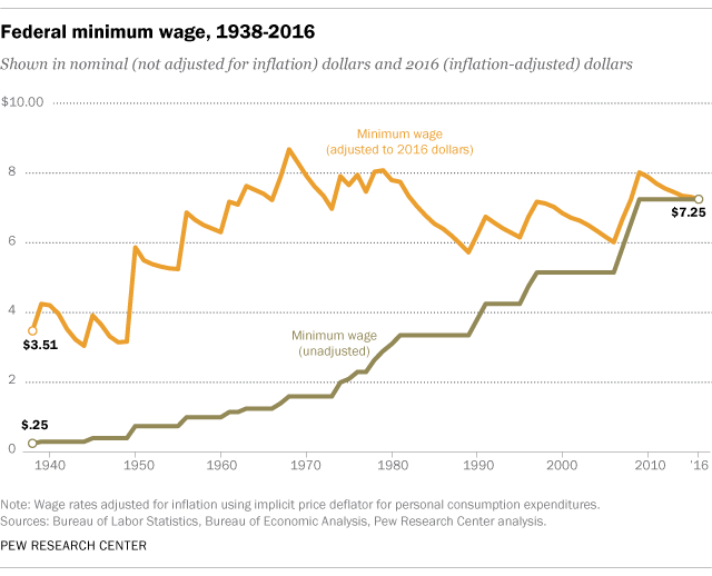
I'm of course well aware that few people will dramatically alter their opinion about the minimum wage based on these kinds of facts.

For example, some will look at the variation across states in minimum wage levels and see it as a sest of differences that are appropriate given the differences in wages and political values across the US states; others will see the difference as a reason the federal government needs to step in and raise minimum wages in states that have been reluctant to do so. As another example, some will look at the figure showing that 2.7% of hourly workers are paid the minimum wage, with the majority of the the "leisure and hospitality" industry like restaurants and food services, and view that as an argument that there's not much reason to raise the minimum wage ("a raise would affect only a narrow slice of workers, most of them young and in food service") while others will look at the same data and view it as a strong justification for  a substantially higher minimum wage ("the low share of hourly workers receiving the hourly minimum wage means it is overdue for a raise").

Still, having an agreed-upon fact base may at least set boundaries of realism that rule out some of the more extreme claims, and in that way help to  focus the arguments. 

Saturday, April 15, 2017

The Economics of Horseshoe Crab Blood

When global demand for a natural product that reproduces only slowly skyrockets, it can be an extinction or near-extinction event. A classic example is how global demand for buffalo hide nearly wiped out the North American bison. Caren Chesler reports an in-progress story about "The Blood of the Horseshoe Crab" in Popular Mechanics (April 13, 2017). The subtitle of the story reads: "Horseshoe crab blood is an irreplaceable medical marvel—and so biomedical companies are bleeding 500,000 every year. Can this creature that's been around since the dinosaurs be saved?"

The situation makes a nice vivid modern example of the "tragedy of the commons," in which private actors driven by their own incentives overuse a common resource until everyone suffers as a result. 
Here's a sampling of Chesler's argument, but the article itself is very much worth reading:
The cost of crab blood has been quoted as high as $14,000 per quart. Their distinctive blue blood is used to detect dangerous Gram-negative bacteria such as E. coli in injectable drugs such as insulin, implantable medical devices such as knee replacements, and hospital instruments such as scalpels and IVs. Components of this crab blood have a unique and invaluable talent for finding infection, and that has driven up an insatiable demand. ... There are currently no quotas on how many crabs one can bleed because biomedical laboratories drain only a third of the crab's blood, then put them back into the water, alive. But no one really knows what happens to the crabs once they're slipped back into the sea. Do they survive? Are they ever the same? ... 
While industry experts say the $14,000-a-quart estimate is high—the figure is more likely the price tag for the coveted amoebocytes that are extracted from the blood—it is testament to how precious LAL [Limulus Amoebocyte Lysatehas] become. To make enough of it for LAL testing, the biomedical industry now bleeds about 500,000 crabs a year. Global pharmaceutical markets are expected to grow as much as 8 percent over the next year. ...
The International Union for Conservation of Nature, which sets global standards for species extinction, created a horseshoe crab subcommittee in 2012 to monitor the issue. The group decided last year that the American horseshoe crab is "vulnerable" to extinction ... "Vulnerable" is just one notch below "endangered," after all. Furthermore, the report said crab populations could fall 30 percent over the next 40 years. (This risk varies by region. While populations are increasing in the Southeast and stable in the Delaware Bay, spawning in the Gulf of Maine is no longer happening at some historic locations and the population continues to decline in New England, largely because of overharvesting.) ... The Atlantic States Marine Fisheries Commission (ASMFC), which manages the fishery resources along the Atlantic coast, has harvest quotas in place on bait fishermen who use horseshoe crabs to catch eels and conch. But not for biomedical laboratories. They can take as many crabs as they like, and that harvest continues to grow. The number of crabs harvested by the U.S. biomedical industry jumped from an estimated 200,000 to 250,000 in the 1990s to more than 610,000 crabs in 2012, according to the ASMFC's latest stock assessment report. ...

The same story plays out across the Pacific Ocean. The horseshoe crab native to Asia, called Tachypleus, produces a different but equally useful version of LAL called Tachypleus Amoebocyte Lysate, or TAL. But horseshoe crabs are already disappearing from beaches in China, Japan, Singapore, Taiwan, and Hong Kong, places where they once thrived. ...

If the species were to dwindle, it wouldn't just be an issue for conservationists but for everyone, as LAL is currently the only substance able to detect gamma-negative bacteria in the health field. As one conservationist put it, "Every man, woman, and child and domestic animal on this planet that uses medical services is connected to the horseshoe crab."
My ignorance of horseshoe crab physiology and ecology is deep and profound, so maybe the environmental concerns here will turn out to be overblown. Also, in this age of genetics and biotechnology, it seems implausible to me that scientists can't eventually find a substitute for the blood of horseshoe crabs! But as long as the blood of horseshoe crabs remains relatively cheap, spending money for research on substitutes doesn't look profitable.  

Friday, April 14, 2017

Julian Simon's "Almost Practical Solution to Airline Overbooking"

As the topic of passengers being hauled off of airplanes hits the headlines, spare a moment to remember how an economist pioneered the idea that if you had a ticket, and the airline wanted to bump you off the flight, the company needed to hold an auction and offer compensation to find a passenger willing to stay back.

It's been almost a half-century since Julian Simon wrote "An Almost Practical Solution to Airline Overbooking," which was a two-page note in the May 1968 Journal of Transport Economics and Policy (pp. 201-2). Here's how Simon described the idea in 1968:
Perhaps the reader has suffered a fit of impotent rage at being told that he could not board an aeroplane for which he held a valid ticket. The explanation is clear, and no angry letter to the president of the airline will rectify the mistake, for mistake it was not. The airline gambles on a certain number of cancellations, and therefore sometimes sells more tickets than there are seats. Naturally there are sometimes more seat claimants than seats.
The solution is simple. All that need happen when there is overbooking is that an airline agent distributes among the ticket-holders an envelope and a bid form, instructing each person to write down the lowest sum of money he is willing to accept in return for waiting for the next flight. The lowest bidder is paid in cash and given a ticket for the next flight. All other passengers board the plane and complete the flight to their destination.
All parties benefit, and no party loses. All passengers either complete their flight or are recompensed by a sum which they value more than the immediate completion of the flight. And the airlines could also gain, because they would be able to overbook to a higher degree than at present, and hence fly their planes closer to seat capacity. ...
But of course this scheme will not be taken up by the airlines. Why? Their first response will probably be "The administrative difficulties would be too great". The reader may judge this for himself. Next they will suggest that the scheme will not increase net revenue. But the a priori arguments to the contrary make the scheme worth a trial, and the trial would cost practically nothing and would require no commitment.
What are the real reasons why this scheme will not be adopted? Probably that "It just isn't done", because such an auction does not seem decorous; it smacks of the pushcart rather than the one price store; it is "embarrassing" and "crass", i.e., frankly commercial, like "being in trade" in Victorian England.
Simon's idea seemed a little ridiculous to a number of commentators back in 1968, the sort of hypothetical, unworldly, and impractical idea that only an economist could favor. After being enacted and around for a few decades, of course, it now seems obvious. In the classroom, it's a nice practical real-world example of what is arguably a Pareto gain.

As Cass Sunstein and others have recently written, the obvious solution to the overbooking problem--at least if you are thinking like an economist--is to change the regulations that limit how much airlines are allowed to pay so that a few passengers can take a later flight. Of course, airlines dislike the idea. When Simon asked why the scheme wouldn't be adopted in the first place, he left out one reason: "The airline already has the money you paid for a ticket, and don't want to return any of it to you if at all possible." But there's a social and political tradeoff here: if airlines want to keep having the freedom to overbook their flights, then they need to face the reality of paying a compensation level so that when a few ticketed passengers can't be accommodated on a given flight, those passengers are willing to postpone their flight voluntarily.

A Truckload of Tips for Teaching Economics

Back in 1990, William McEachern started editing a semiannual newsletter that he called "The Teaching Economist." Each issue had a handful of pithy article, with a heavy emphasis on concrete suggestions linked to actual experience. After 26 years and 52 issues, McEachern has decided to that the Spring 2017 issue, #52, will be the last. However, all the past newsletters are freely available online, and they offer many nuggets for teachers willing to mine the archives. 

For his work as a teacher and textbook author, as well as in editing "The Teaching Economist," McEachern has earned the right to offer some lessons and myths. Here they are:
Students learn by organizing new information into a coherent mental structure, integrating that with their prior knowledge and experience, then retrieving that information repeatedly from memory. Here are four key findings from cognitive science.

Finding # 1: Students are much more likely to recall information that relates somehow to what they already know or have experienced. Spell out how new material relates to existing knowledge or experience. Use examples from student life, current events, and popular culture. Ask students to generate their own examples from personal experience. All this makes new material more memorable.

Finding # 2: The key to long-term learning is practicing retrieval. Many experiments have found that learning improves when students actively retrieve information from memory rather than passively reread class notes or textbooks. Information that’s actively retrieved thereby becomes more accessible in the future and is therefore more transferable to other situations.

Finding # 3: Raise key ideas again and again over time. Retrieval and testing sessions that are spaced out over time are effective for long-term retention and transfer. The long-term benefits of spacing retrieval over time have been found for more than a century of controlled research into human memory. Teachers should align their presentations, assignments, and tests so that key ideas are recalled frequently throughout the term. And students should space their retrieval sessions over time.

Finding # 4: “Desirable difficulties” foster engagement, which helps students learn. Desirable difficulties are challenges introduced during instruction that seem to benefit long-term learning, challenges such as presenting material in different contexts and in different formats. Desirable difficulties may seem to slow the apparent rate of learning in the short run, but they boost long-term retention and transfer. Presentations that challenge students engage them more, and this helps them learn.
And Four Myths

Although cognitive scientists have been studying teaching and learning for decades, not many teachers and fewer students rely on this research even second or third hand. Some teaching and learning practices have no empirical support— they are simply myths. Here are four.

Myths# 1: The mind works like a memory machine. Students believe they sit in class and soak up the knowledge. They read a chapter and absorb the material; they read it again and encode it. The very familiarity of a second reading persuades them that they know the stuff. But test results tell them otherwise. Instead, new information enters long-term memory only if linked to what’s already known, then retrieved repeatedly over time.

Myth# 2: Testing is not learning but is a mere yardstick to measure how much has been learned. Most students don’t like taking tests and most instructors don’t like preparing, administering, and grading them. So testing is usually not a valued activity in itself. Tests, however, are forced retrieval, and this helps students learn and remember. Dozens of studies demonstrate the power of testing as a learning tool, particularly in pointing out weaknesses. Frequent, low-stakes, classroom quizzes may be one of the best ways you can help students learn new material.

Myth# 3: Learning depends on a student’s learning style. According to this myth, some students learn visually, others by hearing, others by reading, and so on. Each student’s brain is a lock that’s accessed only with the right key, the right learning style. Although some students seem to have preferences about how they learn, there is no evidence that customizing instruction to match a student's preferred learning style leads to better achievement. Because interest flows from variety, instructors should offer material using a mix of learning styles.

Myth # 4: Your classroom presentation determines how much students learn.What you do in class matters less than what you ask and expect students to do in your course. Student effort determines how much is learned, how well it's remembered, and under what conditions it's recalled and applied to new situations. Remember, it’s less what you teach and more what students do for themselves to learn.

Wednesday, April 12, 2017

US Polling on Attitudes Toward Trade


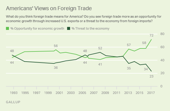
Here's the overall pattern from Gallup based on February 2017 polling:

Graph 1

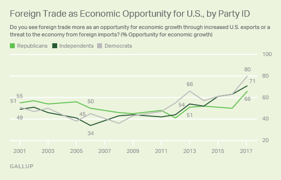
And here's the breakdown by political affiliation:

Graph 2

Poll results are always open to interpretation, and this is obviously no exception. For example, it's possible that anti-Trump forces are rallying to the defense of trade because it seems to them imperiled under the Trump administration. It's also possible that pro-Trump forces are rallying to the defense of trade because they believe that the Trump administration will be cutting much more advantageous trade deals, so that unlike in the past, trade can now help the US economy.

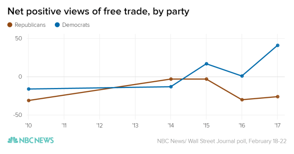
There's also a an NBC News/ Wall Street Journal poll about attitudes toward trade, which asks respondents whether they believe that free trade helps or hurts the country. Here's a figure from the NBC reporting on the poll:


How does one interpret this? The NBC story notes the swing since 2010:
"Looking back to 2010, many Democrats didn't sound unlike their Republican counterparts on the subject of free trade. An NBC News/ Wall Street Journal poll taken that year showed that just 21 percent of Republicans and 27 percent of Democrats thought that free trade helped the country. Fifty-two percent of Republicans and 43 percent of Democrats considered it harmful.  Fast-forward to 2017, and a whopping 57 percent of Democrats say they root for free trade policies, while just 16 percent say that they are harmful. Meanwhile, Republicans, after a burst of comparatively pro-trade sentiment in 2014 and 2015, are back to their 2010 levels." 
Overall, as the Wall Street Journal article on this poll notes, "The poll this month showed the highest portion of Americans who said free trade helped more than hurt since the Journal/NBC News pollsters started asking that question in 1999." In that sense, the findings from the Gallup and NBC/WSJ surveys are congruent with each other, despite the different wording. 

But these survey results may also suggest that US opinions about trade are just not very deeply rooted, and are more expressions of transient emotions and political partisanship. After all, for anyone who was watching either Democrats or Republicans during the presidential primaries, it's not obvious that there was a large supply of latent support for trade. The Wall Street Journal report on the NBC/WSJ survey included this comment: "Essentially what this says is how partisan the world is," said Peter Hart, a Democratic pollster who worked on the survey. "If Trump says the world is flat, the Democrats are going to say it's round."

Finally, it's worth a reminder that the US public attitude toward trade are considerably less positive than those in many other countries around the world. For example, here's a table from the IMF, World Bank, and World Trade Organization report, "Making Trade an Engine of Growth for All: The Case for Trade and for Policies to Facilitate Adjustment"  (March 2017), which I discussed in yesterday's post. The share of Americans who think trade is good is lower than in most advanced economies, and most emerging market and developing economies, too. This international pattern has always struck me as little odd, given that trade represents a relatively small share of the US economy--given the huge size of the US domestic market--and a relatively larger share of GDP for most of these other countries.


Tuesday, April 11, 2017

Addressing Dislocation Costs of Trade: IMF, WTO, WB Weigh In

International trade disrupts the economic patterns that would otherwise exist, and both the benefits and costs of trade flow from such disruptions. The IMF, World Bank, and World Trade Organization have come together to write "Making Trade an Engine of Growth for All: The Case for Trade and for Policies to Facilitate Adjustment," which was published for an international meeting held March 22-23 in Germany.

A lot of the report is about gains from trade, public attitudes toward trade, size of barriers to trade, and possibilities for reducing barriers to trade through negotiations. Here, I'll focus on some points related to the costs of trade disruption and potential policies to address it.

Patterns of global trade in manufacturing have changed substantially since the 1990s. This figure shows that in from 1990-94, 63% of all merchandise trade as between advanced economies. By the 2010-2015 time period, this had dropped to 38%, while 45% of merchandise trade was between advanced economies (AE) and "emerging markets and developing economies" (EMDE), and the remaining 17% was between emerging market and developing economies.

The share of GDP related to manufacturing shifted during this time as well, but perhaps it wasn't always advanced economist that saw declines nor always emerging market and developing economies that saw raises. For example this figure shows that the manufacturing share of GDP decline in the US from 1995-2014, but the decline was smaller than in Canada or the UK--and Germany saw an increase in manufacturing as a share of GDP. Among the emerging market and developing economies, China saw a rise in manufacturing as a share of GDP during this time, algon with Thailand, Vietnam, and Poland, but Brazil and South Africa (abbreviated ZAF) saw declines in manufacturing as a share of GDP during this time.

The report notes that the freedome to import from the world economy is a benefit to consumers: in particular, cheap imports are a huge benefit for those with lower incomes. The report offers a figure drawn from a recent paper by Pablo D. Fajgelbaum and Amit K. Khandelwal, "Measuring the Unequal Gains from Trade," Quarterly Journal of Economics, 2016, 131: 3, pp. 1113-1180. The horizontal axis shows how much the real income (that is, the buying power of income) would fall without trade for the lowest decile by income, while the vertical axis shows how much the real income of the top decile would fall. As the graph shows, for all 40 countries in the study, the loss of income for the poor would be greater than for the rich: for example, in the US cutting off trade would reduce the real income of the bottom decile by almost 70%, but of the top decile by less than 5%. 


However, trade can also disrupt jobs. The discussion of the report on this point isn't extensive, but here are a few snippets (footnotes omitted for readability):
"According to simulation exercises, adjustment frictions in AEs [advanced economies] can lead to transition periods of up to 10 years and reduce the gains from trade by up to 30 percent (Artuç and others, 2013, Dix-Carneiro, 2014). ...  
"An unusual period of sharply increased import competition that began around 2000, along with other factors, appears to have negatively impacted regional labor markets in some AEs. Evidence on most episodes of trade increases suggests that the impact on aggregate labor market outcomes has been mild. When EMDEs [emerging market and developing economies] began to play a greater role in global manufacturing trade, in part reflecting the impact of pro-market reforms in China, a series of studies examined the impact on local labor markets during that period (Autor and others, 2016; Pierce and Schott, 2016a). These studies show that areas more exposed to competition from Chinese manufactures due to their industrial structure saw significant and persistent losses in jobs and earnings, falling most heavily on low-skilled workers. ...
"When switching industries within manufacturing, workers in developed countries have been estimated to forego in terms of lifetime income the equivalent of 2.76 times their annual wage (Artuç and others, 2015). Switching occupations may have similar costs, although these costs vary substantially across occupations and skill levels, with college-educated workers experiencing on average lower costs (Artuç and McLaren, 2015)."

What policies are likely to be most useful for workers dislocated by trade? As the report notes, many of the policies help workers dislocated by trade are the same policies that will help an economy overall to be growing and vibrant. After all, a dynamic and evolving market economy will always experience a churning labor market, with some people losing jobs or leaving jobs and others finding new jobs. Sometimes trade will be the reason, but it can also occur when a suffers domestic competition, or because it falls behind the new technological trends, or because it's poorly managed, or because it misses a shift in consumer tastes.

But going beyond broadly sensible economic policies, are there more focused particular policies that might help adjustment? It's common to discuss "passive" labor market policies like unemployment insurance or early retirement, and to draw a contrast with "active" labor market policies like job search assistance, retraining, incentives for private-sector hiring, and public employment. What's striking from an American perspective is that the US does relatively little of either one compared with many higher-income countries. In this figure the US is the third set of bars from the bottom, just above Chile and Mexico.


The report describes active labor market policies this way: "Generally, displaced workers are required to participate in interviews with employment counselors, apply for identified job vacancies, formulate individual action plans, accept offers of suitable work, and attend training programs if deemed necessary. A recent OECD study found that these activation strategies helped increase re-employment rates, especially in the case of those that are hard-to-place and the long-term unemployed, as may be the case with trade-displaced workers ,,,"

There are a variety of other recommendations, all hedged about with concerns about appropriate design and administration. For example, job training can work well, but it tends to work better if if is closely connected to an actual job, or even on-the-job training. "Housing policies may be necessary to facilitate geographical mobility." "Credit policies can facilitate the overall adjustment process." "`Place-based' policies can help revive economic activity in harder-hit regions."

The report seems still more hesitant about the potential tradeoffs from employment protection and higher minimum wage policies:

"Other aspects of labor-market policies, like employment protection and minimum wage legislation, could be revisited. While employment protection legislation can reduce displacements, it can also impede the needed reallocation. There is broad consensus that employment protection should be limited, and that low hiring/firing costs coupled with protection through unemployment benefits is preferable, as in the case of Nordic countries (Annex E on Denmark). Similarly, minimum wage policies can protect low-skilled workers from exploitation and ensure that they earn a basic level of income (Blanchard and others, 2013).34 However, the policies will need to be designed carefully to avoid potentially negative employment and efficiency effects. An overly high minimum wage, coupled with high payroll taxes, can hinder employment prospects of vulnerable groups (OECD, 2006)."
What about policies targeted in particular at those who have lost their jobs specifically because of import competition, not for other reasons?
"Well-designed and targeted trade-specific support programs can complement existing labor-market programs. ... The effectiveness of these trade-specific programs has been mixed, however, and their coverage and size tends to be very small."
From a US perspective, my own sense is that the US economy should do considerably more in the area of active labor market policies, retraining, and encouraging mobility, and should be experimenting with other local and regional programs. But the reason for these policies isn't primarily about trade. in the US economy, the dislocations from technology and domestic competition are  considerably bigger than the dislocations from trade. Greater mobility and flexibility across the labor market should tend to benefit all employees, whether they are switching jobs by choice or involuntarily.

Afterword: The IMF/WB/WTO report starts with a quotation from the British historian and occasional political figure Thomas Babington Macauley, who wrote in 1824: “Free trade, one of the greatest blessings which a government can confer on a people, is in almost every country unpopular.” There's no citation in the report, and as regular readers know, I prefer to quote only what I can cite.

In this case, the quotation appears in Macauley's 1824 review, "Essay on Mitford's History of Greece," where a fuller version of the quotation reads: "The people will always be desirous to promote their own interests; but it may be doubted whether, in any community, they were ever sufficiently educated to understand them. Even in this island, where the multitude have long been better informed than in any other part of Europe, the rights of the many have generally been asserted against themselves by the patriotism of the few. Free trade, one of the greatest blessings which a government can confer on a people, is in almost every country unpopular. It may be well doubted whether a liberal policy with regard to our commercial relations would find any support from a Parliament elected by universal suffrage."

Monday, April 10, 2017

US Health Care Costs: Same Items, Compared with Other Countries

There are a variety of reasons why the US spends so much more on health care than other countries, but one of them is that prices for many procedures, diagnostic tests, and drugs are higher in the US. Here are some illustrative figures from a set of powerpoint slides produced by the International Federation of health plans in July 2016, called "2015 Comparative Price Report Variation in Medical and Hospital Prices by Country."

It's probably useful here to say where this price data comes from: basically, for each of the non-US countries the price is from a single private provider: for the US, the price data is from four major health insurance firms representing hundreds of millions of medical claims. This suggests that the comparisons should be taken as meaningful, but not precise. Prominent health care economists like Uwe Reinhardt have used the comparisons for that purpose.

More specifically, the report states: "The International Federation of Health Plans is the leading global network of the health insurance industry, with 80 members in 25 countries, ... Prices for each country were submitted by participating federation member plans, and are drawn from public or commercial sectors as follows: • Prices for the United States were derived from over 370 million medical claims and over 170 million pharmacy claims that reflect prices negotiated and paid to health care providers. • Prices for Australia, New Zealand, Spain, South Africa, Switzerland and the UK are from the private sector, with data provided by one private health plan in each country. Comparisons across different countries are complicated by differences in sectors, fee schedules, and systems. In addition, a single plan’s prices may not be representative of prices paid by other plans in that market." The US data apparently come from the Health Care Cost Institute, which in turn gathers data from  Aetna, Humana, Kaiser Permanente, and UnitedHealthcare and makes it available (suitably anonymous, of course) to researchers.

Because the US data comes from a wider variety of sources and from all over the country, the US figures can show the 25th percentile and 95th percentile price: that is, if you ranked all the prices for a given procedure or diagnostic test, what was the price in the 25th and the 95 percentile of that distribution. The overall pattern is that the average US price is often well above the price in the other countries, but in some cases, the 25th percentile price in the US isn't all that different from the other countrries.s

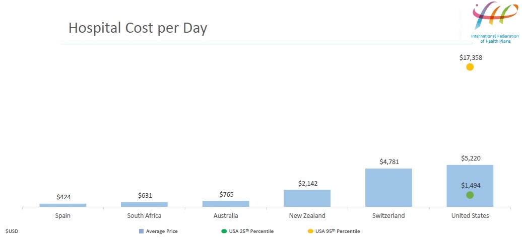
Here are a few patterns that emerge. For hospital prices, the US is the highest, although Switzerland isn't far behind.


A similar pattern holds for hospital-related prices, like coronary bypass surgery and hip replacement


For diagnostics, the US doesn't always lead the way in cost. For example, the cost from a private sector provider in the UK and New Zealand for angiograms and colonoscopies either exceeds or is close to the US average.

For drugs, it's no surprise that the US prices are higher. Here are a couple of examples: Xarelto and OxyContin.


There are some insights from the dots showing the 95th and 25th percentile prices in the US. Especially when you look at the 95th percentile price levels in the US, you can see why the idea of medical tourism is growing. If you are a health insurance company in the US, would you rather pay $57,000 for a hip replacement in a US facility, or, say, $15,000-$17,000--plus some kind of bonus or special treatment for the person receiving the service--to have the procedure done in New Zealand, the UK or Switzerland?  

It's also interesting that the 95th and 25 percentiles are very close together for drugs, compared to the hospital-related or diagnostic services.  In a well-functioning market, competition between providers will tend to drive prices to similar levels.This suggests that drug prices are set in a national market, while the prices for other health services are set in local or perhaps regional markets. I've discussed this pattern before: for example, in Variability in Health Care Prices and Malfunctioning Markets (January 4, 2016). The key point is that there are lessons both in looking at the often-large differences in US health care prices to those of private providers in other countries, but also lessons in looking at the prices differences across the United States--which can be even larger than the differences in cross-national averages.