Rising inequality of incomes in the US is being accompanied by a rising gap in life expectancy by income category. Ronald Lee and Peter R. Orzag chaired a recent committee on behalf of the National Academies of Sciences, Engineering, and Medicine that explains these patterns in "The Growing Gap in Life Expectancy by Income: Implications for Federal Programs and Policy Responses." The analysis has broader implications for how one thinks about inequality, and also specific implications for what this means about old-age support programs like Social Security and Medicare.
One baseline comparison in the report considers those born in 1930, and thus those who entered the labor market during the 1950s and later,with those who were born in 1960, and thus who entered the labor market in the relatively more unequal 1980s and later. The notion is to divide up the income distribution into fifths, or quintiles, based on household earnings from ages 41-50. (Using a decade of income evens out a lot of the year-to-year changes in income that can occur from unemployment.) Then compare life expectancies for the two groups. To be clear, this comparison involves some projections of what life expectancy will be for those who are still alive now, based on patterns of death-by-age up to this point. After all, those born in 1930 would be turning 85 this year, and those born in 1960 would be turning 55 this year.
Here's a comparison for men; green bars show values for those born in 1930; orange bars for those born in 1960. Notice that life expectancy rises with income level: that is, the green bars rise from left to right, and so do the orange bars. However, the gap between the green and orange bars is rising for higher levels of income. More specifically, tThe first bar on the left show that for those men who were born in 1930 and were in the lowest quintile of income for the decade leading up to when they turned 50, their life expectancy at age 50 was 26.6 years. For those born in 1960, the parallel calculation was a life expectancy at age 50 of 26.1 years--which given the uncertainties involved in these calculations can be viewed as basically equal values. However, for those in the top quintile of income, life expectancy at age 50 was 31.7 years for those born in 1930 and 38.8 years for those born in 1960.
Here's the parallel calculation for life expectancies of women. The patterns do differ in some ways. For example, for women born in 1930, life expectancy doesn't rise very much by income over the first four quintiles. However, the gap in life expectancies for those in the top quintile is clearly rising.
Here's an alternative way of illustrating these calculations using "survival rates"--that is, what share of those in a certain birth cohort will live to a certain age. The top panel shows that in 1930 and in 1960 about 26-27% of those in the bottom income quintile at age 50 survive to age 85. However, at the top income quintile, 45% of those in the 1930 cohort lived to age 85, and the projections are that 66% of those in the top quintile of the 1960 birth cohort will live to age 85.
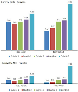
Here are the survival rate patterns for women, again showing a substantial jump in life expectancies for the top quartile.
As the report acknowledges, the reasons for this growing gap in life expectancy by income are not altogether clear. Some explanations clearly aren't supported by facts. For example, although overall levels of tobacco use are down, the decline seems to have happened in much the same way across income levels, and thus can't explain the life expectancy factors. Obesity levels are up over time, but they seem to be up more among those with higher incomes, so that pattern doesn't explain a growing gap in life expectancy by income, either. One hypothesis recognizes that there is a correlation between education and health, and also between education and income, so perhaps factors related to education and health have become more important over time. For example, perhaps those with higher incomes are better at managing chronic diseases like high blood pressure or diabetes. But again, this is an open question. Other possible explanations are looking at how the nature of jobs and job stress may have changed over time for jobs of different income levels, or whether greater inequality in a society may create stresses that affect health.
Whatever the explanations underlying these patterns, there are some implications worth noting.
One is that although discussions of inequality in society often focus on income, this is of course only one potential dimension of inequality. Other dimensions might include the extent to which families have access to appliances like TV, dishwashers, smartphones; or the extent to which families have access to quality education or health care; or access to public facilities like parks and libraries. The fact that the gaps in life expectancy by income are rising over time is surely a major fact to be taken into account in any broader discussion of inequality.
Another implication involves government programs like Social Security and Medicare. These programs involve people paying into the system during their working lives, and then receiving benefits after they retire. However, if life expectancy for those with high incomes is systematically rising faster, then as a result these programs will tend to offer a substantially better deal for those with higher incomes than previously. Moreover, proposals to raise the age of eligibility for Social Security or Medicare will tend to help those with longer life expectancies--which is disproportionately those with higher incomes. In other words, the finding that life expectancy gaps by income are rising suggests that it would be appropriate to re-think contribution and benefit rates by income level for these old-age-support programs.


