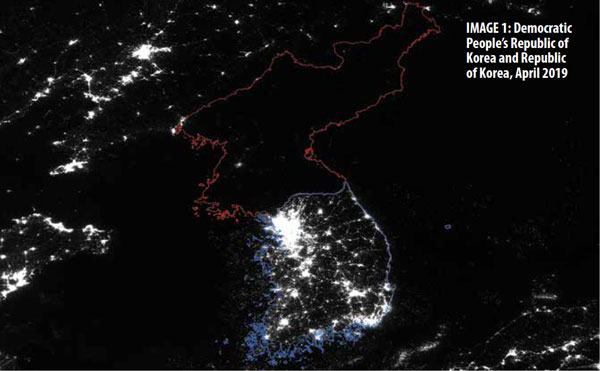
I can quote you various statistics about how the economy of North Korea is estimated at something between $32 billion and $50 billion, with corresponding per capita income of either $1,238 or $1,700. Conversely, South Korea's GDP is $1,619 billion, with a per capita GDP of $31,362. But at least for me, the contrast between darkness and light provides its own gut-level understanding of how people experience big differences in economic growth.
Jiaxiong Yao provides this image and a discussion of the relationship between economic growth and night lights in "Illuminating Economic Growth: Satellite images of the earth at night reveal the pace of economic growth and much more," in the September 2019 issue of Finance & Development.
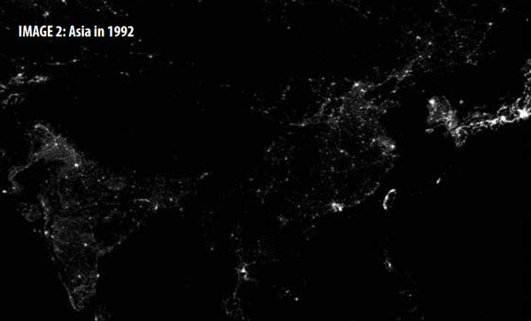
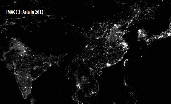
Here's a less well-known but equally striking comparison. The upper image is Asia in 1992: you can see the outline of India on the left, China is in the middle, and to the right there is the dark/light contrast of the Korean peninsula, with Japan at the extreme right. The bottom image is the same frame of countries in 2013. The economic development of India and China is clear--and that image is from six years ago.
Yao points out that while night lights are broadly associated with economic development, the relationship isn't linear, and isn't the same everywhere.
The relationship between night lights and economic development, however, is not always straightforward. In my study with Johns Hopkins University’s Yingyao Hu, we compare night lights with GDP, the official and most commonly used measure of an economy’s performance. We find that rich countries are indeed brighter than less developed countries, but there is no lack of exceptions. On a per capita basis, Nordic countries have almost always been the brightest spots on Earth. On the other hand, Japan, despite being a rich country, looks scarcely brighter than Syria did before the Arab Spring, most likely because of its energy conservation habits and high population density.Another pattern is that emerging market economies which are in the process of dramatically expanding power grids and transportation networks also look much brighter to satellites. However, high-income economies are mainly doing their growth through technology and innovation, which has less effect on light emissions. "In fact, night lights grow only about half as fast as GDP in advanced economies."
Night lights can also be used to estimate GDP in places where collection of economic statistics has broken down.
There is probably nowhere on Earth where good economic data are scarcer than in countries afflicted by conflict—yet these economies are among the places we need to track and understand the most. Statistics agencies in these countries may have long stopped functioning properly, but satellites are still witnessing economic activity. It turns out that we can use night lights to reestimate the GDP of a conflict-stricken country, based on its similarities with other countries at various stages of development. When we do so, we find that the night-light-based GDP measure often points to faster economic deterioration during conflict than the official data show, but this measure also suggests a stronger bounce-back after the conflict ends.For more analytical detail on connections from night lights to GDP, a useful starting point is the IMF Working Paper by Yingyao Hu and Jiaxiong, "Illuminating Economic Growth" (April 9, 2019)
It's also worth noting that satellite data shows a lot more than just night lights--indeed, more than just the visible spectrum. Thus, economists and other researchers are making increasing use of this data to look at a range of other issues including pollution, forest cover/deforestation, roofs/buildings in studies of urban development, cars/traffic. I offer a quick overview of this work, with some additional images, in "Economics and Satellite Data" (November 10, 2016). For a readable broader discussion of satellite data and how it can be used, see Dave Donaldson and Adam Storeygard, "The View from Above: Applications of Satellite Data in Economics," in the Fall 2016 issue of the Journal of Economic Perspectives (30:4, 171-98).