Friday, November 30, 2018

Unauthorized Immigrants to US Continues to Decline

The total number of unauthorized immigrants in the US climbed very rapidly in the 1990s and early 2000, but peaked around 2007, and has declined since then. Jeffrey S. Passel and D’Vera Cohn report details in "U.S. Unauthorized Immigrant Total Dips to Lowest Level in a Decade," just published by the Pew Research Center (November 28, 2018).

Here's an illustrative figure. The number of unauthorized immigrants more than doubled in the 1990s from 3.5 million in 1990 to 8.6 million, and then kept rising up to 12.2 million in 2007, but has declined since then.

I've noted this decline and discussed some of the reasons for this drop in the number of unauthorized immigrants in earlier posts (see here and here): for example, the Great Recession in the US from 2007-2009, improved growth prospects for Mexico's economy in the last couple of decades, fewer children per women and an overall aging of Mexico's workforce, and stepped-up border enforcement.

The report from Passel and Cohn breaks down the estimates of unauthorized immigrants in a variety of ways: by location, age, occupation, parental status, and so on. Here, I'd like to emphasize two points.

First, back in the 1990s it was generally true that the number of unauthorized migrants who had been in the US for less than five years and the number who had been here for more than 10 years was about the same. But with the passage of time since the 1990s, and the dropoff in recent unauthorized immigration, we have moved to a situation where about two-thirds of the unauthorized immigrants have now been here for more than 10 years, and only 18% have been here for less than five years. "By 2016, an unauthorized immigrant adult had typically lived in the U.S. for 14.8 years, compared with a median 8.6 years in 2007."
To put differently, one can argue that a main policy problem of the 1990s and early 2000s was to limit additional unauthorized immigration, and that both the Clinton and Bush administrations failed to do so. But the main immigration enforcement problem at present is not to block growing numbers of unauthorized migrants: it is how we address the issue of about 7 million unauthorized immigrants who have been here more than a decade, and who have put down roots in their communities. For example, about 43% of the unauthorized immigrants live in households that include a total of about 5 million US-born, American-citizen children.

The other main point is that the situations of the United States and the European Union are quite different when it comes to migration. Indeed, one can make a case that the unauthorized immigration situation currently faced by the European Union is similar, or perhaps more extreme, than the situation the US faced in the 1980s and 1990s. Fundamental drivers of unauthorized immigration are large differences in birthrates and in economic prospects. In the 1980s and 1990s, these factors drove unauthorized immigration from Mexico to the United States. Now, those factors are driving unauthorized immigration from Africa to the European Union.

A couple of years ago, I wrote about an article by Gordon Hanson and Craig McIntosh called "Is the Mediterranean the New Rio Grande? US and EU Immigration Pressures in the Long Run," which appeared in the Fall 2016 issue of the Journal of Economic Perspectives. They wrote:
The European immigration context today looks much like the United States did three decades ago. In Europe, which long ago made its demographic transition to low birth rates, declines in fertility in the 1970s and 1980s set the stage for a situation in which the number of working-age residents is in absolute decline. Countries in the North Africa and Middle East region, in contrast, have had continued high fertility, creating bulging populations of young people looking for gainful employment in labor markets plagued by low wages and the scarcity of steady work. Further to the south, population growth rates in sub-Saharan Africa, a region with still lower relative earnings, remain among the highest in the world. ...
As an example, we predict the number of African-born first-generation migrants aged 15 to 64 outside of sub-Saharan Africa to grow from 4.6 million to 13.4 million between 2010 and 2050. During this same period, the number of working-age adults born in the region will expand from under half a billion to more than 1.3 billion, meaning that international migration would only absorb 1 percent of the overall population growth. ... The coming half century will see absolute population growth in sub-Saharan Africa five times as large as Latin America’s growth over the past half century. 
If Americans want to imagine the political tensions over immigration in the European Union, imagine try to imagine the current US political climate if instead of having the total number of unauthorized immigrants falling during the last 10 years, the total had instead been increasing strongly over the last 10 years--and was predicted to keep doing so into the future.

P.S. A recent alternative study of the size of the unauthorized immigrant population estimates a substantially higher total. Mohammad M. Fazel-Zarandi, Jonathan S. Feinstein, Edward H. Kaplan published "The number of undocumented immigrants in the United States: Estimates based on demographic modeling with data from 1990 to 2016," in PLoS ONE (published September 21, 2018). Two quick comments here:

1) Although this study finds a higher total number of unauthorized immigrants at any given time, the pattern over time is the same: that is, a sharp rise in the 1990s and the early 2000s, and then a leveling off after about 2007. 

2) The assumptions behind these alternative estimates have been questioned. In a follow-up "Commentary" published simultaneously online on PLoS One, Randy Capps, Julia Gelatt, Jennifer Van Hook, and Michael Fix point out that the model is not benchmarked against other available demographic data, and in fact is inconsistent with such data. In particular, their estimates are highly sensitive to what assumptions are made about how many unauthorized immigrants return to Mexico and other places on their own: if you assume that very few return (an assumption not backed up by the available survey evidence), then the total remaining the US will obviously look much higher. 

Thursday, November 29, 2018

Snapshots of Falling US Mobility

Americans are moving less, although the reasons aren't clear. The US Census Bureau has just released an updated set of tables and graphs showing the trend.

For example, here's the overall pattern. The blue bars show the total number of movers (measured on the left axis) while the black line shows the mover rate relative to population (measured on the right axis).
Figure A-1. Number of Movers and Mover Rate: 1948-2018
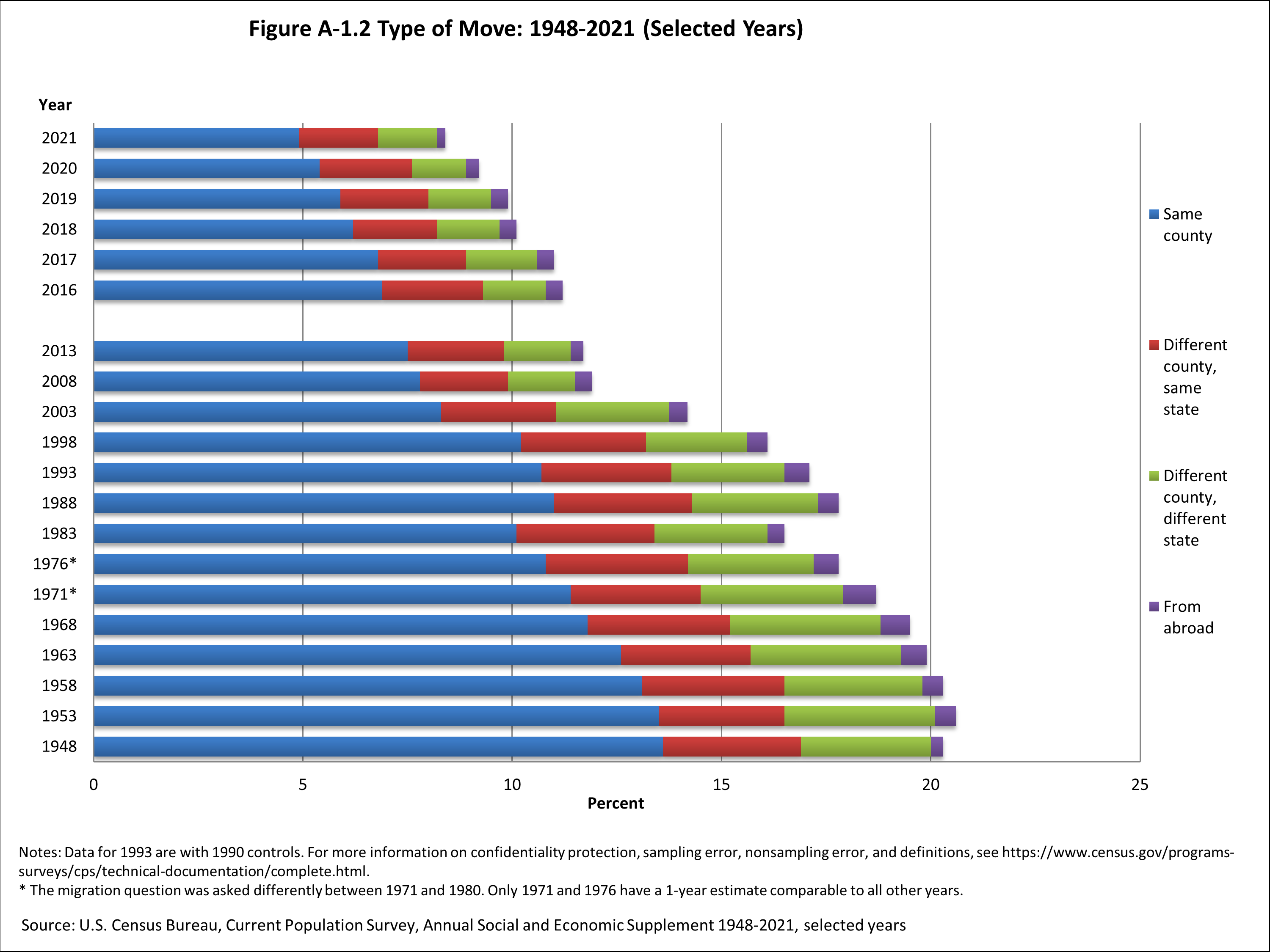
Although moves of all types have declined, the number of short-distance moves within a given county has fallen somewhat more.

number of relatively short moves, under 50 miles, hasn't fallen much. It's the longer-distance moves that have fallen.


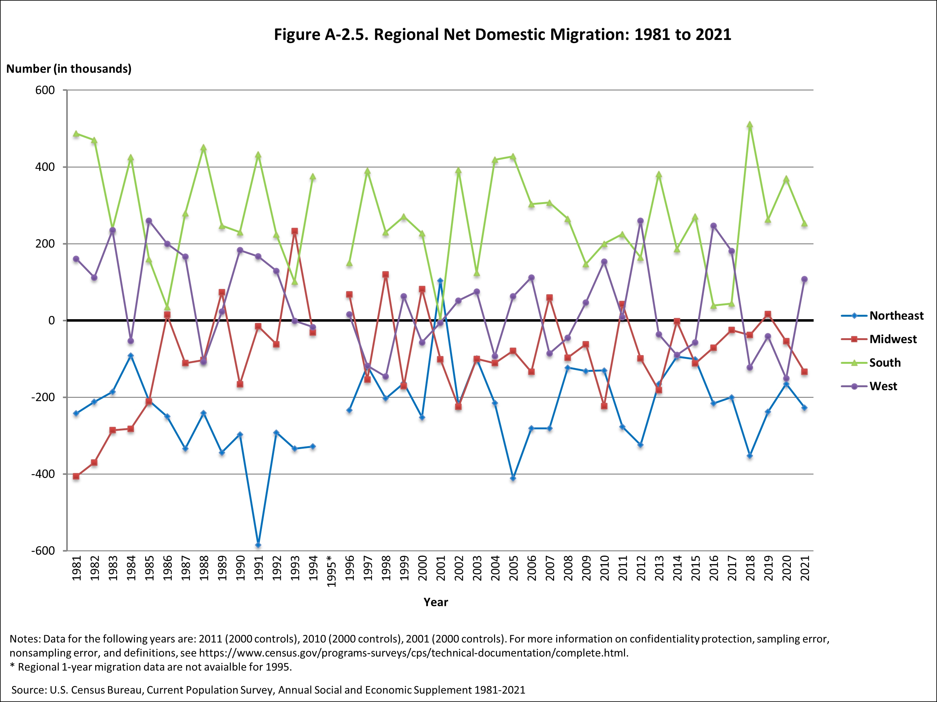
I also thought the regional pattern of net domestic migration was interesting. The Northeast has consistently been losing population to moves; the South has been consistently gaining; and the West and Midwest as a whole have been roughly breaking even.

The reasons for this decline in mobility are not clear. A good explanation needs to explain a long-term trend--that is, pointing to something like people who didn't want to move after the drop in housing prices in 2008 can't explain a pattern that has been going on for decades. Moreover, most common explanations are easily tested. For example, if the reason for declining mobility is the US population getting older, then younger  households should be continuing to move at the same rate, which isn't actually true.

For an overview of the research on this topic from a few years back, Raven Molloy, Christopher L. Smith, and Abigail Wozniak wrote "Internal Migration in the United States." in the Summer 2011 issue of the Journal of Economic Perspectives. For example, they write: "Migration rates have fallen for most distances, demographic and socioeconomic groups, and geographic areas. The widespread nature of the decrease suggests that the drop in mobility is not related to demographics, income, employment, labor force participation, or homeownership."

About a year ago, David Schleicher discusses the issue in "Stuck! The Law and Economics of Residential Stagnation," appearing in the Yale Law Journal (October 2017, 127:1, pp. 78-154). (I discussed the article here.) He argues that a wide variety of local and state rules and regulations have combined to make movement more difficult: like limits on residential building that drive up the price of housing and rules requiring state-level occupational licenses for certain jobs.

The question of why US mobility is falling can be rephased in this way: Why don't we see more movement from areas with lower wages and fewer jobs to areas with better economic prospects? It used to be that US regions with lower income levels had faster growth, and thus tended to converge with the rest of the country. But regional convergence has now slowed down dramatically, or even stopped.

I'm not sure what might best be done about the decline in mobility, but it seems to me a legitimate public concern. It's bad for an economy when labor resources are not being reallocated to areas where they would be more productive. In addition, less mobility means that people have less shared life experience with others across a range of neighborhoods, communities and regions.

Wednesday, November 28, 2018

Some Alternative Baskets of Goods for Measuring Inflation

When explaining or teaching about measures of inflation, a usual starting point is to talk about a "basket" of goods--for example, a combination of goods that reasonably represents a typical pattern of consumption for urban households underlies the Consumer Price Index. Basic measures of inflation look at what it would cost to purchase this same basket of goods at two points in time.

This approach raises an obvious question: What about if someone is not a member of an average household? Averages can mislead: as we say in my part of the world, based on yearly averages, the Great Lakes never freeze. What about inflation for households that are poor or rich, older or younger, or face a specific situation? The straightforward and practical approach is to define a separate basket of goods that does represent your group of interest more accurately.

As one example, along with the Consumer Price Index for All Urban Consumers (CPI-U), which represents the spending habits for roughly 90 percent of the population of the United States, and the Consumer Price Index for Urban Wage Earners and Clerical Workers (CPI-W), which represents a smaller subset of about 30 percent of the U.S. population, the Bureau of Labor Statistics also produces an experimental Consumer Price Index-Elderly (CPI-E). The basket of goods in this index gives greater weight to health care, for example, because that category represents a larger share of spending for the elderly. There are occasional proposals that the CPI-E should be used for the annual cost-of-living adjustment applied to Social Security benefits, instead of the CPI-W used at present. Over the period from 1982-2014, annual Social Security adjustments would have been a modest 0.2% per year higher with this change.

The Federal Reserve Bank of Atlanta has set up an interesting website, myCPI, which lets you plug in some specific information about number of people in a household, income, homeowner vs. renter, and some other factors. The choices are fairly course: for example, there are only three categories for age and income, and two categories for education level. But it does show that measures of inflation will differ when taking different baskets of goods into account.

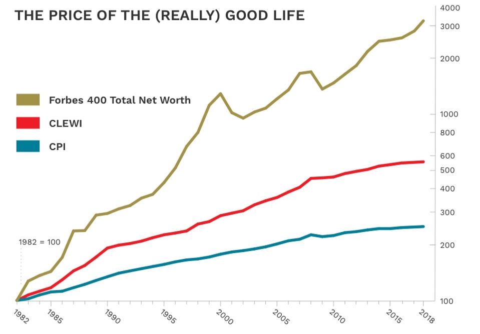
Some non-government groups have used the idea of a basket of goods as the basis for an annual article or report. For example, Forbes magazine publishes an annual Cost-of-Living-Extremely-Well Index (CLEWI). The index is based on 40 luxury items: for example, an ebonized Model D concert-grand Steinway piano in  New York; a pair of 12-gauge side-by-side sporting shotguns from James Purdey & Sons in New Jersey; 12 cotton bespoke shirts from Turnbull & Asser in the UK; a Jules Audemars self-winding, 18-karat pink gold, alligator strap, Audemars Piguet Swiss watch; a case of Dom Perignon champagne; installing a Har-Tru crushed stone tennis court in Connecticut; and others. The CLEWI has been rising faster than the Consumer Price Index over time, but luckily for the very rich, the net worth of the Forbes 400 has risen faster still.


Another example is the annual American Farm Bureau estimate of the cost of Thanksgiving dinner. This year, they sent out 166 volunteer shoppers to grocery stores in 37 states, with the task of calculating what it would cost to purchase the ingredients for a representative dinner. The items include: 

For an overview of some historical examples of price indexes, a useful starting point is the short article by Joseph Persky, "Retrospectives: Price Indexes and General Exchange Values," in the Winter 1998 issue of the Journal of Economic Perspectives. Perhaps my favorite  historical example is the basket of goods used by the state of Massachusetts in 1780. As Persky describes it (citations omitted):
In 1780, Massachusetts enacted what may be the first documented case of formal price indexation. ... [F]acing a crisis in maintaining Revolutionary War enlistments at a time when the value of the currency was unstable and falling, they hit upon a scheme to use indexed interest-bearing notes as payment. Both principal and interest on these ‘‘depreciation notes’’ were to be paid not at their nominal values but ‘‘in the then current Money of the State, in a greater or less Sum, according as Five Bushels of Corn, Sixty-eight Pounds and four-seventh Parts of a Pound of Beef, Ten Pounds of Sheeps Wool, and Sixteen Pounds of Sole Leather shall then cost, more or less than One Hundred and Thirty Pounds of Current Money.’’ Pursuant to the Massachusetts act, county agents were named and charged with collecting average price data every month.
There is apparently some historical question as to whether this price index was calculated accurately and honestly, but I love the example nonetheless. The idea of price indexes was apparently in the air around this time. Persky writes: "An Italian named G. R. Carli is often credited with having developed the first price index number. In work published about a decade before The Wealth of Nations, Carli made a serious empirical investigation of prices over time, including a simple average of the percentage changes in three commodities—grain, wine and oil—over the period 1500 to 1750."

Of course, the idea of buying a fixed basket of goods at two different points in time opens up a number of other obvious questions, too, which I haven't discussed here. What if consumers shift their pattern of consumption over time, perhaps by substituting goods that have become cheaper for goods that have become more expensive? What if the qualities of specific products change and evolve over time? What if new goods enter the market and replace older goods?

A body of economics research and several prominent commissions have looked at these issues of bias from substitution, quality change, and new goods over time.  For a recent discussion of these issues, a useful starting point is the report by Brent R. Moulton, "The Measurement of Output, Prices, and Productivity: What’s Changed Since the Boskin Commission?" written for the Hutchins Center on Fiscal and Monetary Policy at Brookings (July 2018). For discussion of the Boskin Commission, see the six-paper symposium on "Measuring the CPI" in the Winter 1998 issue of the Journal of Economic Perspectives. For discussion of the Schultze commission report a few years later, see the three-paper symposium on the "Consumer Price Index" in the Winter 2003 issue of the JEP

Tuesday, November 27, 2018

Gender Wage Gaps Around the World

On average, women around the world are paid 15.6% per hour less than men. The Global Wage Report 2018-2019, just published by the International Labour Organization, devotes two main chapters to the theme "What lies behind gender pay gaps." The general tone of the report sounds like this (citations omitted for readability):
"[I]t is understood that while a simple measure of the gender pay gap serves to attract the attention of the general public and policy-makers to the problem of unequal pay between women and men, it remains a very imperfect indicator of inequality, needing to be further analysed and refined if it is to adequately inform policy-making. A gender pay gap measured simply – the so-called “raw” or unadjusted gender pay gap – can arise for a multitude of different reasons, including, among others: differences between female and male educational attainments; lower wages in the sectors and occupations in which women are concentrated; differences between female and male participation rates in part-time and full-time work, which are in turn influenced by women’s role as mothers and their care responsibilities; and discrimination in pay between women and men performing equal work or work of equal value. The most appropriate mix of policy responses will differ across countries, depending on which factors have the largest impact on the gender pay gap in each national context."
As one example of the issues, here are two figures on the raw gender wage gap across countries. The first looks at wages per hour; the second looks at earnings per month. Thus, the second figure reflects both lower wages and lower average hours for women.

The report walks through a number of possible explanations for gender wage gaps--although because the ILO is focused on a cross-country analysis, it is somewhat limited by what kinds of cross-country data are available. But for example, while lower education levels might have played a role in lower human capital for women some decades in the past, those education gaps have now been dramatically reduced, and do not seem like a likely mechanism for explaining the curent gender gap.

However, there are at least four patterns behind the gender wage gap that show up strongly in the cross country data.

One is "vertical occupational segregation," which refers to a common pattern that although education levels are similar, women are more likely to be found in lower-skilled occupational categories.
"[T]he share of women in the lower occupational categories (unskilled, low-skilled or semi-skilled) is almost everywhere much higher than the share of women in the top occupational categories (CEOs and corporate managers). For example, in Finland, only 20 per cent of CEOs are women, whereas about 70 per cent of semi-skilled jobs are occupied by women. This illustrates “vertical occupational segregation” – that is, the clustering of men at the top of occupational hierarchies and of women at the bottom."
A second pattern is that firms that employ a larger share of women tend to pay lower wages.

A third pattern relates to parental status. Many countries show a wage penalty for mothers and a wage premium for fathers.

Finally, labor force participation is lower for women.
"[T]the low labour market participation of women vis-à-vis men is a global phenomenon. Irrespective of income level, in all countries and at any age group, women’s participation rates are always below those of men. ... [F]or most countries, the trend in participation rates for women starts to separate further from that of men at about the age of 25–35 years old, coinciding with the beginning of the period of motherhood. Finally, in only a few of the countries shown here (Armenia, Australia, Mongolia, Philippines, Russian Federation, Ukraine) is there any “bounce back” into the labour market for women. In most other countries, it seems that motherhood has a long-term effect: once the participation of women declines at around the age of 25–30 years, the proportion of women who stay in (or out) of the labour market across all other age groups thereafter remains constant until approximately retirement age. ... Globally, women are still substantially less likely than men to participate in the labour market. The global gap in labour force participation has been estimated at 27 percentage points, and participation gaps remain particularly wide in the Arab States, northern Africa and southern Asia, in each case exceeding 50 percentage points.
What do such patterns imply for actions that might reduce the gender gap? The ILO report discusses a wide variety of possibilities, including collective bargaining, minimum wages, and others. Here, I'll focus on my thoughts about some policies with a more direct relationship to the gender gap.

1) Laws about "equal pay for equal work" can have only limited effect on the gender wage gap if much of the gap traces back to different jobs, different employers, and effects of motherhood on labor force participation. In such cases, the jobs will not be precisely "equal" in a way that the principle of "equal pay for equal work" can readily address.

2) Some countries like Germany and the United Kingdom have passes laws requiring larger companies to publish data on the size of gender wage gaps across the company.

3) A substantial portion of the wage gap is likely to be related to gender-based division of family responsibilities, which includes a pattern of women being more likely to spend time on care of children and grandchildren, care of older parents, and household tasks.

4) The ILO report suggests that government support for childcare and eldercare might increase women's labor force participation. My own reading is that the cross-country evidence on this conclusion is mixed. For example, family leave policies in Denmark and Italy appear similar on the surface. But the effect of such policies in Denmark is to support higher labor force participation of women, while the effect in Italy is to support a substantial amount of exit from the labor force for women. In other words, family leave policies can have quite different effects depending on the social context of the country that enacts them.

Obviously, the gender wage gap is not purely a labor market phenomenon, but arises in the context of social expectations and choices within households about time allocation. Interested readers wanting more might start with a three-paper symposium on "Women in the Labor Market in the Winter 2017 issue of the Journal of Economic Perspectives:

Or here are some earlier posts addressing various aspects of the topic:

Friday, November 23, 2018

Opening Some Windows Into Recent Economic Research

Readers who find this blog a useful stimulus for reflection might also be interested in checking the "Research Highlights" webpage run by the American Economic Association. I'm the Managing Editor of the Journal of Economic Perspectives, which is one of the seven journals currently published by the AEA (with an eighth journal scheduled to start publishing next year). Once or twice a week, the Research Highlights page picks a recent article from these journals and offers a short readable overview or an interview with the author. For those interested getting a sense of a wide array of recent economic research, it's a good starting point. For a flavor, here's a list of the nine most recent entries:

Building trust with buyers (November 21, 2018)
How much do offers of "satisfaction guaranteed" improve efficiency in the marketplace?

Making economics transparent and reproducible (November 16, 2018)
The AEA interviews Ted Miguel about the credibility of economics.

Shadow business (November 12, 2018)
How many cartels exist and how important is competition policy to reining them in?

The heroin balloon (November 7, 2018)
A push to make prescription opioids more difficult to abuse touched off a surge of heroin deaths.

Fragile innovation (November 2, 2018) 
This video explains how financial innovation helped cause the 2008 financial crisis.

How Democrats lost the South (October 29, 2018)
The AEA interviews Ilyana Kuziemko and Ebonya Washington about why Southern states turned Republican in the 1960s.

Modern family (October 24, 2018)
How do parental leave policies affect relationship stability at home?

Boosting mobile savings (October 19, 2018)
Can automatic enrollments encourage saving in developing countries?

Cutting taxes, creating jobs (October 15, 2018)
How would lowering the corporate tax rate affect entrepreneurial decisions and employment?

Thursday, November 22, 2018

Thanksgiving History: George Washington, Sarah Josepha Hale, Abraham Lincoln

Thanksgiving is a day for a traditional menu, and I take a holiday by reprinting this annual column on the origins of the day:

The first presidential proclamation of Thanksgiving as a national holiday was issued by George Washington on October 3, 1789. But it was a one-time event. Individual states (especially those in New England) continued to issue Thanksgiving proclamations on various days in the decades to come. But it wasn't until 1863 when a magazine editor named Sarah Josepha Hale, after 15 years of letter-writing, prompted Abraham Lincoln in 1863 to designate the last Thursday in November as a national holiday--a pattern which then continued into the future.

An original and thus hard-to-read version of George Washington's Thanksgiving proclamation can be viewed through the Library of Congress website. The economist in me was intrigued to notice that some of the causes for giving of thanks included "the means we have of acquiring and diffusing useful knowledge ... the encrease of science among them and us—and generally to grant unto all Mankind such a degree of temporal prosperity as he alone knows to be best."

Also, the original Thankgiving proclamation was not without some controversy and dissent in the House of Representatives, as an example of unwanted and inappropriate federal government interventionism. As reported by the Papers of George Washington website at the University of Virginia.
The House was not unanimous in its determination to give thanks. Aedanus Burke of South Carolina objected that he “did not like this mimicking of European customs, where they made a mere mockery of thanksgivings.” Thomas Tudor Tucker “thought the House had no business to interfere in a matter which did not concern them. Why should the President direct the people to do what, perhaps, they have no mind to do? They may not be inclined to return thanks for a Constitution until they have experienced that it promotes their safety and happiness. We do not yet know but they may have reason to be dissatisfied with the effects it has already produced; but whether this be so or not, it is a business with which Congress have nothing to do; it is a religious matter, and, as such, is proscribed to us. If a day of thanksgiving must take place, let it be done by the authority of the several States.”
Here's the transcript of George Washington's Thanksgiving proclamation from the National Archives.
Thanksgiving Proclamation
By the President of the United States of America. a Proclamation.
Whereas it is the duty of all Nations to acknowledge the providence of Almighty God, to obey his will, to be grateful for his benefits, and humbly to implore his protection and favor—and whereas both Houses of Congress have by their joint Committee requested me “to recommend to the People of the United States a day of public thanksgiving and prayer to be observed by acknowledging with grateful hearts the many signal favors of Almighty God especially by affording them an opportunity peaceably to establish a form of government for their safety and happiness.”
Now therefore I do recommend and assign Thursday the 26th day of November next to be devoted by the People of these States to the service of that great and glorious Being, who is the beneficent Author of all the good that was, that is, or that will be—That we may then all unite in rendering unto him our sincere and humble thanks—for his kind care and protection of the People of this Country previous to their becoming a Nation—for the signal and manifold mercies, and the favorable interpositions of his Providence which we experienced in the course and conclusion of the late war—for the great degree of tranquillity, union, and plenty, which we have since enjoyed—for the peaceable and rational manner, in which we have been enabled to establish constitutions of government for our safety and happiness, and particularly the national One now lately instituted—for the civil and religious liberty with which we are blessed; and the means we have of acquiring and diffusing useful knowledge; and in general for all the great and various favors which he hath been pleased to confer upon us.
and also that we may then unite in most humbly offering our prayers and supplications to the great Lord and Ruler of Nations and beseech him to pardon our national and other transgressions—to enable us all, whether in public or private stations, to perform our several and relative duties properly and punctually—to render our national government a blessing to all the people, by constantly being a Government of wise, just, and constitutional laws, discreetly and faithfully executed and obeyed—to protect and guide all Sovereigns and Nations (especially such as have shewn kindness unto us) and to bless them with good government, peace, and concord—To promote the knowledge and practice of true religion and virtue, and the encrease of science among them and us—and generally to grant unto all Mankind such a degree of temporal prosperity as he alone knows to be best.
Given under my hand at the City of New-York the third day of October in the year of our Lord 1789.
Go: Washington
Sarah Josepha Hale was editor of a magazine first called Ladies' Magazine and later called Ladies' Book from 1828 to 1877. It was among the most widely-known and influential magazines for women of its time. Hale wrote to Abraham Lincoln on September 28, 1863, suggesting that he set a national date for a Thankgiving holiday. From the Library of Congress, here's a PDF file of the Hale's actual letter to Lincoln, along with a typed transcript for 21st-century eyes. Here are a few sentences from Hale's letter to Lincoln:
"You may have observed that, for some years past, there has been an increasing interest felt in our land to have the Thanksgiving held on the same day, in all the States; it now needs National recognition and authoritive fixation, only, to become permanently, an American custom and institution. ... For the last fifteen years I have set forth this idea in the "Lady's Book", and placed the papers before the Governors of all the States and Territories -- also I have sent these to our Ministers abroad, and our Missionaries to the heathen -- and commanders in the Navy. From the recipients I have received, uniformly the most kind approval. ... But I find there are obstacles not possible to be overcome without legislative aid -- that each State should, by statute, make it obligatory on the Governor to appoint the last Thursday of November, annually, as Thanksgiving Day; -- or, as this way would require years to be realized, it has ocurred to me that a proclamation from the President of the United States would be the best, surest and most fitting method of National appointment. I have written to my friend, Hon. Wm. H. Seward, and requested him to confer with President Lincoln on this subject ..."
William Seward was Lincoln's Secretary of State. In a remarkable example of rapid government decision-making, Lincoln responded to Hale's September 28 letter by issuing a proclamation on October 3. It seems likely that Seward actually wrote the proclamation, and then Lincoln signed off. Here's the text of Lincoln's Thanksgiving proclamation, which characteristically mixed themes of thankfulness, mercy, and penitence:
Washington, D.C.
October 3, 1863
By the President of the United States of America.
A Proclamation.
The year that is drawing towards its close, has been filled with the blessings of fruitful fields and healthful skies. To these bounties, which are so constantly enjoyed that we are prone to forget the source from which they come, others have been added, which are of so extraordinary a nature, that they cannot fail to penetrate and soften even the heart which is habitually insensible to the ever watchful providence of Almighty God. In the midst of a civil war of unequaled magnitude and severity, which has sometimes seemed to foreign States to invite and to provoke their aggression, peace has been preserved with all nations, order has been maintained, the laws have been respected and obeyed, and harmony has prevailed everywhere except in the theatre of military conflict; while that theatre has been greatly contracted by the advancing armies and navies of the Union. Needful diversions of wealth and of strength from the fields of peaceful industry to the national defence, have not arrested the plough, the shuttle or the ship; the axe has enlarged the borders of our settlements, and the mines, as well of iron and coal as of the precious metals, have yielded even more abundantly than heretofore. Population has steadily increased, notwithstanding the waste that has been made in the camp, the siege and the battle-field; and the country, rejoicing in the consiousness of augmented strength and vigor, is permitted to expect continuance of years with large increase of freedom. No human counsel hath devised nor hath any mortal hand worked out these great things. They are the gracious gifts of the Most High God, who, while dealing with us in anger for our sins, hath nevertheless remembered mercy. It has seemed to me fit and proper that they should be solemnly, reverently and gratefully acknowledged as with one heart and one voice by the whole American People. I do therefore invite my fellow citizens in every part of the United States, and also those who are at sea and those who are sojourning in foreign lands, to set apart and observe the last Thursday of November next, as a day of Thanksgiving and Praise to our beneficent Father who dwelleth in the Heavens. And I recommend to them that while offering up the ascriptions justly due to Him for such singular deliverances and blessings, they do also, with humble penitence for our national perverseness and disobedience, commend to His tender care all those who have become widows, orphans, mourners or sufferers in the lamentable civil strife in which we are unavoidably engaged, and fervently implore the interposition of the Almighty Hand to heal the wounds of the nation and to restore it as soon as may be consistent with the Divine purposes to the full enjoyment of peace, harmony, tranquillity and Union.
In testimony whereof, I have hereunto set my hand and caused the Seal of the United States to be affixed.
Done at the City of Washington, this Third day of October, in the year of our Lord one thousand eight hundred and sixty-three, and of the Independence of the United States the Eighty-eighth.
By the President: Abraham Lincoln
William H. Seward,
Secretary of State

The Dominance of Peoria in the Processed Pumpkin Market

As I prepare for a season of pumpkin pie, pumpkin bread (made with cornmeal and pecans), pumpkin soup (especially nice wish a decent champagne) and perhaps a pumpkin ice cream pie (graham cracker crust, of course),  I have been mulling over why the area around Peoria, Illinois, so dominates the production of processed pumpkin.

[In honor of pumpkin pie, I'm repeating this blog from a year ago.]

The facts are clear enough. As the US Department of Agriculture points out (citations omitted):
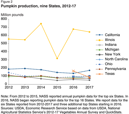
In 2016, farmers in the top 16 pumpkin-producing States harvested 1.1 billion pounds of pumpkins, implying about 1.4 billion pounds harvested altogether in the United States. Production increased 45 percent from 2015 largely due to a rebound in Illinois production. Illinois production, though highly variable, is six times the average of the other top eight pumpkin-producing States (Figure 2).
Production increased 45 percent from 2015 largely due to a rebound in Illinois production. Illinois production, though highly variable, is six times the average of the other top eight pumpkin-producing States.

Not only does Illinois produce more pumpkins, but a much larger share of pumpkins from this state end up being processed, rather than used fresh. The USDA reports:
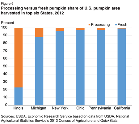
Illinois harvests the largest share of processing pumpkin acres among all States—almost 80 percent. Michigan is next with a little over 10 percent. Other States harvest less than 5 percent processing pumpkins.

It's not really the entire state of Illinois, either, but mainly an area right around Peoria. The University of Illinois extension service writes: "Eighty percent of all the pumpkins produced commercially in the
U.S. are produced within a 90-mile radius of Peoria, Illinois. Most of those pumpkins are grown for processing into canned pumpkins. Ninety-five percent of the pumpkins processed in the United States are grown in Illinois. Morton, Illinois just 10 miles southeast of Peoria calls itself the `Pumpkin Capital of the World.'"

Why does this area have such dominance? Weather and soil are part of the advantage, but it seems unlikely that the area around Peoria is dramatically distinctive for those reasons alone. This also seems to be a case where an area got a head-start in a certain industry, established economies of scale and expertise, and has thus continued to keep a lead. The Illinois Farm Bureau writes: "Illinois earns the top rank for several reasons. Pumpkins grow well in its climate and in certain soil types. And in the 1920s, a pumpkin processing industry was established in Illinois, Babadoost [a professor at the University of Illinois] says. Decades of experience and dedicated research help Illinois maintain its edge in pumpkin production." According to one report, Libby’s Pumpkin is "the supplier of more than 85 percent of the world’s canned pumpkin."

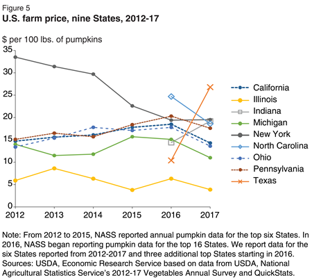
The farm price of pumpkins varies considerably across states, which suggests that it is costly to ship substantial quantities of pumpkin across moderate distances. For example, the price of pumpkins is lowest in Illinois, where supply is highest, and the Illinois price is consistently below the price for other nearby Midwestern states. This pattern suggests that the processing plants for pumpkins are most cost-effective when located near the actual production.

While all States see year-to-year changes in price, New York stands out because prices have declined every year since 2011. Illinois growers consistently receive the lowest price because the majority of their pumpkins are sold for processing.

Finally, although my knowledge of recipes for pumpkin is considerably more extensive than my knowledge of supply chain for processed pumpkin, it seems plausible that demand for pumpkin is neither the most lucrative of farm products, nor is it growing quickly, so it hasn't been worthwhile for potential competitors in the processed pumpkin market to try to establish an alternative pumpkin-producing hub somewhere else.

An Economist Chews over Thanksgiving

As Thanksgiving preparations arrive, I naturally find my thoughts veering to the evolution of demand for turkey, technological change in turkey production, market concentration in the turkey industry, and price indexes for a classic Thanksgiving dinner. Not that there's anything wrong with that. [Note: This is an updated and amended version of a post that was first published on Thanksgiving Day 2011.]

The last time the U.S. Department of Agriculture did a detailed "Overview of the U.S. Turkey Industry" appears to be back in 2007, although an update was published in April 2014 . Some themes about the turkey market waddle out from those reports on both the demand and supply sides.

On the demand side, the quantity of turkey per person consumed rose dramatically from the mid-1970s up to about 1990, but then declined somewhat, but appears to have made a modest recovery in the last few years The figure below is from the Eatturkey.com website run by the National Turkey Federation.


On the production side, the National Turkey Federation explains: "Turkey companies are vertically integrated, meaning they control or contract for all phases of production and processing - from breeding through delivery to retail." However, production of turkeys has shifted substantially, away from a model in which turkeys were hatched and raised all in one place, and toward a model in which the steps of turkey production have become separated and specialized--with some of these steps happening at much larger scale. The result has been an efficiency gain in the production of turkeys. Here is some commentary from the 2007 USDA report, with references to charts omitted for readability:
"In 1975, there were 180 turkey hatcheries in the United States compared with 55 operations in 2007, or 31 percent of the 1975 hatcheries. Incubator capacity in 1975 was 41.9 million eggs, compared with 38.7 million eggs in 2007. Hatchery intensity increased from an average 33 thousand egg capacity per hatchery in 1975 to 704 thousand egg capacity per hatchery in 2007.
Some decades ago, turkeys were historically hatched and raised on the same operation and either slaughtered on or close to where they were raised. Historically, operations owned the parent stock of the turkeys they raised while supplying their own eggs. The increase in technology and mastery of turkey breeding has led to highly specialized operations. Each production process of the turkey industry is now mainly represented by various specialized operations.
Eggs are produced at laying facilities, some of which have had the same genetic turkey breed for more than a century. Eggs are immediately shipped to hatcheries and set in incubators. Once the poults are hatched, they are then typically shipped to a brooder barn. As poults mature, they are moved to growout facilities until they reach slaughter weight. Some operations use the same building for the entire growout process of turkeys. Once the turkeys reach slaughter weight, they are shipped to slaughter facilities and processed for meat products or sold as whole birds.
Turkeys have been carefully bred to become the efficient meat producers they are today. In 1986, a turkey weighed an average of 20.0 pounds. This average has increased to 28.2 pounds per bird in 2006. The increase in bird weight reflects an efficiency gain for growers of about 41 percent."
The 2014 report points out that the capacity of eggs per hatchery has continued to rise (again, references to charts omitted):
"For several decades, the number of turkey hatcheries has declined steadily. During the last six years, however, this decrease began to slow down. As of 2013, there are 54 turkey hatcheries in the United States, down from 58 in 2008, but up from the historical low of 49 reached in 2012. The total capacity of these facilities remained steady during this period at approximately 39.4 million eggs. The average capacity per hatchery reached a record high in 2012. During 2013, average capacity per hatchery was 730 thousand (data records are available from 1965 to present)."
U.S. agriculture is full of examples of remarkable increases in yields over perionds of a few decades, but they always drop my jaw. I tend to think of a "turkey" as a product that doesn't have a lot of opportunity for technological development, but clearly I'm wrong. Here's a graph showing the rise in size of turkeys over time from the 2007 report.


The production of turkey remains an industry that is not very concentrated, with three relatively large producers and then more than a dozen mid-sized producers. Here's a list of top turkey producers in 2015 from the National Turkey Federation:

Given this reasonably competitive environment, it's interesting to note that the price markups for turkey--that is, the margin between the wholesale and the retail price--have in the past tended to decline around Thanksgiving, which obviously helps to keep the price lower for consumers. However, this pattern may be weakening over time, as margins have been higher in the last couple of Thanksgivings  Kim Ha of the US Department of Agriculture spells this out in the "Livestock, Dairy, and Poultry Outlook" report of November 2018.. The vertical lines in the figure show Thanksgiving. She writes: "In the past, Thanksgiving holiday season retail turkey prices were commonly near annual low points, while wholesale prices rose. ... The data indicate that the past Thanksgiving season relationship between retail and wholesale turkey prices may be lessening."

In the past, the US turkey industry has at some times suffers from outbreaks of HPAI
(Highly Pathogenic Avian Influenza): for discussion of the 2015 outbreak, see the November 17, 2015 issue of the "Livestock, Dairy, and Poultry Outlook" from the US Department of Agriculture, Kenneth Mathews and Mildred Haley offer some details. But for Thanksgiving 2018, supply seems to have remained strong and wholesale turkey prices have stayed low.

For some reason, this entire post is reminding me of the old line that if you want to have free-flowing and cordial conversation at dinner party, never seat two economists beside each other. Did I mention that I make an excellent chestnut stuffing?

Anyway, the starting point for measuring inflation is to define a relevant "basket" or group of goods, and then to track how the price of this basket of goods changes over time. When the Bureau of Labor Statistics measures the Consumer Price Index, the basket of goods is defined as what a typical U.S. household buys. But one can also define a more specific basket of goods if desired, and since 1986, the American Farm Bureau Federation has been using more than 100 shoppers in states across the country to estimate the cost of purchasing a Thanksgiving dinner. The basket of goods for their Classic Thanksgiving Dinner Price Index looks like this:


The cost of buying the Classic Thanksgiving Dinner actually declined by a bit in 2018, fallingfrom to $49.12 in 2018 to $48.90 in 2018. The top line of the graph that follows shows the nominal price of purchasing the basket of goods for the Classic Thanksgiving Dinner. The lower line on the graph shows the price of the Classic Thanksgiving Dinner adjusted for the overall inflation rate in the economy. The lower line is relatively flat, which means that inflation in the Classic Thanksgiving Dinner has actually been a pretty good measure of the overall inflation rate.


Thanksgiving is a distinctively American holiday, and it's my favorite. Good food, good company, no presents--and all these good topics for conversation. What's not to like?

Wednesday, November 21, 2018

Four Follow-Ups: Scandinavia, Equal Opportunity, Brexit, Leveraged Lending

I sometimes run across articles that offer additional follow-up on topics about which I've previously posted, or stories in the news that remind me of earlier posts. Here, I'll just offer short follow-ups on an eclectic set of four topics:

  • The Scandinavian style of capitalism, 
  • Economic gains from in equal opportunity
  • The news about Brexit
  • Possible systemic risks of the risks of leveraged lending

1)  "The Scandinavian Style of Capitalism" (November 5, 2018)

I wrote a few weeks ago about the actual specific attributes of the style of capitalism practiced in countries of northern Europe. (Hint: It isn't "socialism," and it has a number of traits of which many American supporters of a Scandinavian approach seem largely unaware.) A reader forwarded to me this report Sweden's Ministry of Finance  called "The Swedish Model" (June 20, 2017).

Some of the report is the kind of stuff that any government says when it is not-too-subtly praising itself. It's not incorrect, but it does tend to sidestep concerns and problem. From the perspective of an an American who often hears casual references to the Swedish model or Scandinavian model, it's interesting to consider the emphasis that the report puts on a shared social responsibility. Here's a representative paragraph:
"The distinguishing characteristics of the Swedish labour market are coordinated wage formation, an active labour market policy and effective unemployment insurance. The fundamental premise is that individuals should contribute through work and be willing to adjust to new tasks. Provided that individuals perform this part of the social contract, they qualify for rights in the form of income-related social security, and, after needs assessment by the Public Employment Service, active initiatives to facilitate the return to work after having become unemployed. In addition, there is a certain level of financial security for people who do not qualify for income-related social security benefits. The social partners also provide a large portion of support in connection with unemployment through various career readjustment agreements."
Some of those who favor what they think of as a Scandinavian approach to labor markets tend to emphasize the government benefits, but not to put an equal and counterbalancing emphasis on the responsibility of individuals to adjust to new tasks and careers. The report also emphasizes the importance in the Swedish model of a fiscal policy that "is sustainable over the long term ... with surplus targets, expenditure ceilings, a municipal balanced budget requirement and rigorous budget process," as well as the central importance of promoting competitiveness in open international trade
2) "Equal Opportunity and Economic Growth" (August 1, 2012)

Back in 2012, I noted a study of how improvements in equal opportunity benefit economic growth, because an economy that makes fuller use of its human resources will be larger. For an illustration of shifts toward more equal opportunity, Pete Klenow offered this table. Based on joint research with others, he argued that about 15-20% of total US growth from 1960 to 2008 can be explained by women and African-Americans investing more in human capital and working in high-skill occupations.

For those who would like to see the underlying research behind this result, the most recent (April 6, 2018) version of the research paper is available at Klenow's website. Their current estimate is that "[a]bout one-quarter of growth in aggregate output per person over this period [from 1960 to 2010] can be explained by the improved allocation of talent." There's a cautionary insight her about how how academic research really works. The preview of these findings from six years ago, back in 2012, has mostly the same bottom line result as the current paper. But the authors have spent years writing and revising to sharpen the analysis and to address detailed questions that have been raised. And the paper isn't published yet.

3) The United Kingdom and the European Union have agreed on the text of a draft agreement for how the UK might leave the EU. The news stories caused me to reflect on two earlier posts. In
"Seven reflections on Brexit" (June 27, 2016), I offered some thoughts in the immediate aftermath of the Brexit vote. For example, here was my first point:
1) The Brexit vote seemed to me a strangely American moment. Some of the lasting slogans handed down from the American revolution against England are "no taxation without representation" and "don't tread on me." Thus, for an American there was some historical irony in hearing many of the British argue, in effect, that there should be "no regulation without representation," or perhaps "no legislation without representation." There was similar irony in hearing some of the British turn loose their "don't tread on me" spirit while railing against annoying but in some sense small-scale regulatory impositions from the central power, like rules that sought to standardize shapes and sizes for fruit and vegetable produce, or the rules with force of law that sales of loose and packaged good use only metric measurements. I found myself half-expecting some "Leave" advocates to start quoting the US Declaration of Independence: "When in the Course of human events, it becomes necessary for one people to dissolve the political bands which have connected them with another, and to assume among the powers of the earth, the separate and equal station to which the Laws of Nature and of Nature's God entitle them ..."
For a discussion of the economic studies about Brexit options and their effects, see "Brexit: Getting Concrete about Next Steps" (August 2, 2016) and "Brexit: Still a Process, Not Yet a Destination" (November 17, 2017).

4) "Corporate Debt and Leveraged Loans: Financial Snags Ahead?" (September 21, 2018)

Stop me if you've heard this story before. Certain loans look too risky for any bank to make on its own. So groups of lenders combine to make such loans, and then repackage groups of these loans as complex financial securities, and then resell the in pieces to investors all over the economy.  Just which financial institutions are are exposed to the downside risks is unclear. But we do know that the volume of these loans is growing fast, while the credit standards applied to granting such loans has been declining. Although this general description seems as if it could apply to the wave of lending in US housing markets in the lead-up the Great Recession, it also applies to the current wave of what is called "leveraged lending."  For an earlier post on the subject, see "Leveraged Loans: A Danger Spot?" (October 4, 2014).

Three economists from the IMF, Tobias Adrian, Fabio Natalucci, and Thomas Piontek, have wrtten a recent blog post ""Sounding the Alarm on Leveraged Lending" (November 15, 2018). Among other concerns, they offer this figure:


Similarly, the Office of Financial Research has just published its Annual Report to Congress 2018, "which presents its assessment of the state of the U.S. financial system, as required by the Dodd-Frank Wall Street Reform and Consumer Protection Act of 2010." Its overall assessment is that "risks to U.S. financial stability are still in a medium range overall." But it highlights leveraged lending as an area of concern. The report notes:
"Rapid growth in leveraged lending is a concern. These commercial loans, often used by borrowers with credit ratings below investment grade for buyouts, acquisitions, or capital distributions, can leave borrowers highly indebted. Strong investor demand for these higher-yielding loans is behind the rapid growth. Less creditworthy corporations took advantage of that demand by seeking more funding in leveraged loan markets. As a result, more than $1 trillion of leveraged loans are outstanding. That is more than 11 percent of all U.S. nonfinancial debt — a record high. With the growth in leveraged lending has come a deterioration in the credit quality of newly issued loans. One sign of this decline is the high share of covenant-lite loans ... Covenants are restrictions placed on debt-issuing firms meant to increase the likelihood of payment. Another sign of deterioration in underwriting quality is that more than half of all leveraged loans issued are rated B+ or lower (that is, highly speculative). "
Investors in such bonds, and financial regulators, should be paying attention here. 

Tuesday, November 20, 2018

Catastrophe Bonds: A Primer

Most bonds are a way for corporations and government to borrow money. A catastrophe bond is different. It's effectively a way for an insurance firm to re-insure some of the extreme risks it faces.
Andy Polacek offers a nice overview in "Catastrophe Bonds: A Primer and Retrospective," a recent 
Chicago Fed Letter (2018, No. 405).

Polacek offers a nice concrete example of how a CAT bond works. The American Family Mutual Insurance Company wanted to be reinsured if it experienced very high losses due to severe thunderstorms and tornadoes in the United States. Thus, in November 2010 it set up a "special purpose vehicle" called Mariah Re Ltd. to issue a CAT bond.

It worked like this. Investors in the CAT bond put up $100 million. That money was immediately invested in US Treasury securities. In addition, American Family Mutual Insurance Company agreed to pay the investors an additional return of 6.25% per year, over a three-year period. If there were no excessive losses from thunderstorms during those three years, the CAT bond would end, and the $100 million would be refunded to the original investors.

However, every CAT bond has built into it an "attachment point," which specifies when a certain large-scale event has occurred. It might refer to an earthquake of a certain size, or to a certain kind of storm causing at least a certain magnitude of losses. In the case of American Family Mutual Insurance Company and Mariah Re, the "attachment point" occurred "if estimated losses to the P&C insurance industry from severe thunderstorms and tornadoes across the U.S. exceeded $825 million ... After the $825 million attachment point was reached, AFMI would receive $1 in compensation for every $1 of additional covered losses up to the $100 million limit." A third party is designated in advance to decide if the "attachment point" has been reached: in this case, the third party was a company called AIR Worldwide.

This example helps to clarify the risk-sharing properties of a CAT bond. For the insurance company, issuing a CAT bond is a way of purchasing re-insurance against extreme losses. But it has some advantages over purchasing reinsurance. Because the money is sitting in an account, there is no danger that the reinsurance company might be unable to pay. Also, a CAT bond can be set up to cover a period of several years, while a reinsurance purchase is typically for one year. Finally, because lots of investors like pension funds, mutual funds, and hedge funds can buy CAT bonds, the pool of funds available for reinsurance becomes a lot larger than the available capital of reinsurance companies taken alone

For investors, a CAT bond offers a rate of return with a degree of risk, with the nice property that the occurrence of extreme insurance events is typically not much correlated with other risks in financial markets. In this particular case of American Family Mutual Insurance Company and Mariah Re, the US experienced a huge number of costly and deadly tornadoes in 2011, leading to insured losses of $954 million. This total was more than $100 million above the attachment point of $825 million, so that investors in this CAT bond lost all of the $100 million they had invested. But over time, the actual returns from investing in CAT bonds have been attractive.

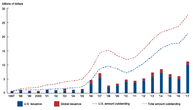
This figure shows the growth in total issuance of catastrophe bonds over time, now at about $25 billion worldwide.

Catastrophe bond issuance and amount outstanding, 1997-2017


One of the most interesting uses of CAT bonds is not by insurance or reinsurance companies, but by governments. Payouts from these CAT bonds often triggered by measures of the strength of the covered catastrophe—such as an earthquake’s magnitude or a hurricane’s wind speed and barometric pressure. As a result, it is typically quite clear when a trigger has been exceeded, and the fund to cover the catastrophe can be released very quickly, when they are needed. In the US, the California Earthquake Authority (CEA) and the Florida Hurricane Catastrophe Fund (FHCF) issue catastrophe bonds. "The Caribbean Catastrophe Risk Insurance Facility (CCRIF)—developed with the assistance of the World Bank—has used CAT bonds ... After Hurricane Matthew struck the Caribbean in the fall of 2016, the CCRIF paid out a little over $20 million to Haiti and almost $1 million to Barbados within 14 days after the triggering event."

A common concern about any new financial instrument is that it will work until investors take substantial and losses, and then it may fade away. Thus, it is a good sign for the fundamental health of catastrophe bonds as a useful financial innovation that even after experiencing very large losses for investors in 2017, it kept growing in 2018. Polacek writes:
"In the first half of 2018, the CAT bond market saw strong growth even after unequivocally the worst period for CAT bond investors in the market’s 20-year history. Led primarily by losses from Hurricanes Irma, Harvey, and Maria, 19 separate CAT bond tranches were triggered in the third quarter of 2017, leaving as much as $1.4 billion in outstanding issuance vulnerable to losses (the actual loss amount is not yet known given that many insurance claims still need to be resolved). Despite the historic level of losses at the end of 2017, new CAT bond issuance in the first half of 2018 reached $9.4 billion, rivaling 2017’s record start.20 Currently, the insurance industry is working to improve CAT bond modeling to cover new types of risk—such as cyberattack and terror risks. So, it appears that the uses of CAT bonds will continue to grow, offering issuers new avenues to transfer a variety of risks."
For a previous post on CAT bonds, see "The Allure of Catastrophe Bonds" (August 25, 2016).

Monday, November 19, 2018

Economics of Mushroom Production: Kennett Square and the Rise of China

Mushrooms are a relatively small US agricultural crop, with total production of about $1.2 billion in the 2017-2018 growing year. But they do illustrate some economic lessons, including how a local area that develops a specialization in a certain product can be hard to dislodge, and how the rise of China is reshaping global production in so many ways.

US mushroom production has for a long time been very geographically concentrated. The town of Kennett Square in southeastern Pennsylvania bills itself as the Mushroom Capital of the World, because about half of all US mushroom production happens in the surrounding area of Chester County.

The story here goes back to 1885, and to a florist named William Swayne who lived in Kennett Square. Swayne grew a lot of carnations, which required raised beds. He pondered whether it might be possible to grow a cash crop in the space under those raised beds. Mushrooms had been domesticated in France and England in the middle of the 19th century. Swayne sent away to England for mushroom spores, and began growing them. The demand was high enough that he built a "mushroom house," an enclosed building designed to grow only mushrooms. Other local farmers took note, and the Mushroom Capital of the World became established.

From an economic point of view, an obvious question is why mushroom production remains so concentrated in Chester County more than 120 years later. After all, the basic materials for growing mushrooms like compost from vegetative material (like straw and hay), along with animal manure, are not hard to find. The climate of southeastern Pennsylvania provides a usefully cool ground temperature in fall, winter, and spring, but there are many other locations with similar temperatures.

Although I do not know of a systematic study of mushroom technology, there are some obvious hypotheses as to why mushroom growing has stayed so geographically concentrated. Many types of production look fairly easy from the outside. But when it comes to large-scale commercial production that covers costs and makes a profit, it seems likely that growing mushrooms commercially requires detailed skill and knowledge that spreads among the workers and producers in a geographically close community--in much the same way that software developers flourish in the area around Silicon Valley. In addition to a local labor force with crop-specific skills, local producers build up a chain of processors, wholesalers, national distribution networks, and retailers that is not quickly duplicated. The producers around Kennett Square have shown an ability to dramatically increase production over time: for example, back in 1967 the total US production of mushrooms was 157 million pounds, with 57% coming from Pennsylvania mushroom farmers; in recent years, total US production of mushrooms has risen by a multiple of six at over 900 million pounds.  Finally, the relatively small size of the mushroom market can limit the incentives for new competitors to make substantial investments in trying to take over this market.  

But from the perspective of global mushroom production, this sixfold increase in US mushroom production in the last half-century is only a modest part of the story. The growth of China's economy has led an extraordinary rise in global mushroom production in the last 20 years. Daniel J. Royse , Johan Baars and Qi Tan provide  background in "Current Overview of Mushroom Production in the World." which appears as Chapter 2 in the 2017 book Edible and Medicinal Mushrooms: Technology and Applications, edited by Diego Cunha Zied and Arturo Pardo-Giménez. As they note (references omitted):
World production of cultivated, edible mushrooms has increased more than 30‐fold since 1978 (from about 1 billion kg in 1978 to 34 billion kg in 2013). This is an extraordinary accomplishment, considering the world’s population has increased only about 1.7‐fold during the same period (from about 4.2 billion in 1978 to about 7.1 billion in 2013). Thus, per capita consumption of mushrooms has increased at a relatively rapid rate, especially since 1997, and now exceeds 4.7 kg annually (vs 1 kg in 1997; Figure 2.2). ...
China is the main producer of cultivated, edible mushrooms (Figure 2.3). Over 30 billion kg  of mushrooms were produced in China in 2014, and this accounted for about 87% of total production. The rest of Asia produced about 1.3 billion kg, while the EU, the Americas, and other countries produced about 3.1 billion kg.
Here's a figure showing growth of mushroom production vs. world population.

And here's a figure showing global mushroom production by location:

For sales of fresh mushrooms within the US and Canada, Kennett Square doesn't appear to be under immediate threat. But a 2010 report of the US International Trade Commission pointed out that the US became a net importer of processed mushrooms--typically grown in China--back in 2003-2004.

Friday, November 16, 2018

Solow on Friedman's 1968 Presidential Address and the Medium Run

Fifty years ago in 1968, Milton Friedman's Presidential Address to the American Economic Association set the stage for battles in macroeconomics that have continued ever since. The legacy of the talk has been important enough that in the Winter 2018 issue of the Journal of Economic Perspectives, where I work as Managing Editor, we published a three-paper symposium on "Friedman's Natural Rate Hypothesis After 50 Years."
Likewise, the Review of Keynesian Economics has committed now most of its October 2018 issue to a nine-paper symposium on the issues raised by Friedman's presidential address. The first two papers in the issue, by Robert Solow and Robert J. Gordon, are freely available on-line, with the rest of the issue requiring a library subscription. Here, I'll focus mainly on Solow's comments.

What was the key insight or argument in Friedman's 1968 address? Friedman offers a reminder that interest rates and unemployment rates are set by economic forces. Friedman uses this idea to build a distinction between the long-run and the short-run. In the short run, it is possible for a central bank like the Federal Reserve to influence interest rates and the unemployment rate. In the long run, there is a "natural" rate of interest and a "natural" rate of unemployment which is trying to emerge, gradually, over time from all the various forces in the economy

This short-run, long-run distinction then led to differing views over the appropriate role of government macroeocnomic policy. In the magisterial Monetary History of the United States that Friedman had published in 1963 with Anna J. Schwartz, they make a powerful case that the effect of monetary policy in the past had often been to make the macroeconomic situation worse, rather than better. Given the practical imperfections faced by monetary policy (including time lags and political biases in the the policy response and the long and variable lags in how monetary policy affects macroeconomic variables),  Friedman argued that the “first and most important lesson” is that “monetary policy can prevent money itself from being a major source of economic disturbance.” While Friedman was open to the idea of macroeconomic policy responding to extreme economic situations, he worried about policy mistakes and overreactions.

One standard counterargument was that monetary policy and the macroeconomy had become much better understood over time, thanks in part to Friedman's work. Thus, example of past misguided policy should not immobilize central bankers thinking about future policy choices.

Robert Solow is a notable player in these disputes: in particular, in his 1960 paper with Paul Samuelson, "Analytical Aspects of Anti-Inflation Policy" (American Economic Review, 50:2, pp. 177-194). In an essay in the Winter 2000 issue of the Journal of Economic Perspectives, "Toward a Macroeconomics of the Medium Run,"  Solow addressed this question of thinking about macroeconomic policy in the short- and the long-run. He wrote:
I can easily imagine that there is a “true” macrodynamics, valid at every time scale. But it is fearfully complicated, and nobody has a very good grip on it. At short time scales, I think, something sort of “Keynesian” is a good approximation, and surely better than anything straight “neoclassical.” At very long time scales, the interesting questions are best studied in a neoclassical framework, and attention to the Keynesian side of things would be a minor distraction. At the five-to-ten-year time scale, we have to piece things together as best we can, and look for a hybrid model that will do the job.
In this most recent essay, "A Theory is a Sometime Thing," Solow pushes this idea of medium-run thinking harder. He acknowledges that if a central bank can only cause the interest rate and unemployment rate to shift for a year or two, in the short-run before a rebound to what is determined in the long run, then when problems of lags in timing are included, macroeconomic policy might be dysfunctional. But if a central bank can affect the interest rate and the unemployment rate for a medium-run period of, say 5-7 years, then even with some uncertainty and lags, macroeocnomic policy may be quite relevant and possible. At one point, Solow writes: "The medium run is where we live."
On the issue of interest rates, Solow points out in the late 1970s and early 1980s, Paul Volcker's actions pushed up interest real interest rates substantially, such that the real federal funds interest rate "rose sharply to about 5 percent and fluctuated around that level for the next six years ...This sustained 5 percentage point increase in the real funds rate was not a random event. It was a deliberate intervention, designed to end the ‘double-digit’ inflation of the early 1970s, and it did so, with real side-effects. ... So the Fed was in fact able to control (‘peg’) its real policy rate, not for a year or two but for at least six years, certainly long enough for the normal conduct of counter-cyclical monetary policy to be effective. 
The history of the Bernanke/Yellen Fed is more complicated ..... The Fed was apparently able to lower the real ten-year Treasury bond rate for half a dozen years, 2011–2016. Of course there are many influences on the real long interest rate; it is at least plausible that large Fed purchases contributed to the outcome that the Fed was consciously seeking. The difference between ‘a year or two’ and ‘half a dozen years’ is not a small matter.
What about the natural rate of unemployment? One implication of Friedman's arguments was that if the government used macroeconomic policy in an attempt to hold the unemployment rate below it's natural rate in the long-run, it would lead to surges of ever-higher inflation. As Solow notes, in the 1970s and early 1980s, sharp drops in the unemployment rate do seem associated with rising inflation. But the main story about inflation in the last 20-25 years is that it doesn't seem to react to much: it doesn't get a lot higher or a lot lower as the unemployment rate rises and falls. Solow goes so far as to claim: "[T]there is no well-defined natural rate of unemployment, either statistically or conceptually."

For a more positive gloss on the legacy of Friedman's argument and its applications to modern macroconomics, I commend your attention to the JEP articles listed above. Here, Solow ends  his note with the kind of elegant rhetorical flourish that he brings to so much of his writing:
"A few major failures like those I have registered in this note may not be enough for a considered rejection of Friedman's doctrine and its various successors. But they are certainly enough to justify intense skepticism, especially among economists, for whom skepticism should be the default mental setting anyway. So why did those thousand ships sail for so long, why did those ideas float for so long, without much resistance? I don't have a settled answer.
One can speculate. Maybe a patchwork of ideas like eclectic American Keynesianism, held together partly by duct tape, is always at a disadvantage compared with a monolithic doctrine that has an answer for everything, and the same answer for everything. Maybe that same monolithic doctrine reinforced and was reinforced by the general shift of political and social preferences to the right that was taking place at about the same time. Maybe this bit of intellectual history was mainly an accidental concatenation of events, personalities, and dispositions. And maybe this is the sort of question that is better discussed while toasting marshmallows around a dying campfire."
Here's a Table of Contents for the relevant papers in the October 2018 issue of the Review of Keynesian Economics:
Along with the JEP papers mentioned earlier, those interested in the subject may also want to consult the paper by Edward Nelson, “Seven Fallacies Concerning Milton Friedman’s `The Role of Monetary Policy,'" *Finance and Economics Discussion Series 2018-013, Board of Governors of the Federal Reserve System,

Thursday, November 15, 2018

Superstar Firms and Cities

Imagine two people who have seemingly equal skills and background. They go to work for two different companies. However, one "superstar" company grows much faster, so that wages and opportunities in that company also grow much faster. Or they go to work in two different cities. One "superstar" urban economy grows much faster, so that wages and opportunities in that city also grow faster.

Of course, such patterns of unequal growth have always existed  to some extent. When evaluating a potential employer or location choice, people  have always taken into account the potential for joining a superstar performer. The interesting question is whether the gap between superstar and ordinary firms, or between superstar and ordinary cities, has been growing or changing over time. For example, some argue that the rise of superstar firms, and the resulting rise in between-firm performance and labor compentiation, can explain most of the rise in US income inequality.

The McKinsey Global Institute has a nice report summarizing past evidence and offering new evidence of their own in Superstars: The Dynamics of Firms, Sectors, and Cities Leading the Global Economy (October 2018). It's written by a team led by James Manyika, Sree Ramaswamy,  Jacques Bughin, Jonathan Woetzel, Michael Birshan, and Zubin Nagpal. Short summary: Superstar firms and cities do seem to be widening their economic leadership gap, with the evidence that certain sectors are superstars seems weaker.

For superstar firms, the report notes:
"For firms, we analyze nearly 6,000 of the world’s largest public and private firms, each with annual revenues greater than $1 billion, that together make up 65 percent of global corporate pretax earnings. In this group, economic profit is distributed along a power curve, with the top 10 percent of firms capturing 80 percent of economic profit among companies with annual revenues greater than $1 billion. We label companies in this top 10 percent as superstar firms. The middle 80 percent of firms record near-zero economic profit in aggregate, while the bottom 10 percent destroys as much value as the top 10 percent creates. The top 1 percent by economic profit, the highest economic-value-creating firms in our sample, account for 36 percent of all economic profit for companies with annual revenues greater than $1 billion. Over the past 20 years, the gap has widened between superstar firms and median firms, and also between the bottom 10 percent and median firms. ... The growth of economic profit at the top end of the distribution is thus mirrored at the bottom end by growing and increasingly persistent economic losses ..."
Here's an illustrative figure, showing firms by decile, and comparing the time windows from 1995-97 and from 2014-2016.

Some other patterns are that the superstar firms "come from all sectors and regions and include global banks and manufacturing companies, long-standing Western consumer brands, and fast-growing US and Chinese tech firms. The sector and geographic diversity of firms in the top 10 percent and the top 1 percent by economic profit is greater today than 20 years ago." Along with being more profitable, superstar firms spend more on R&D and on intangible investments like intellectual property, software, and brand value. In additinon, the rate of movement (or the "churn") in and out of the deciles doesn't seem to have changed much over time. 
"In the top 1 percent by economic profit, only one out of every six of today’s superstar firms has been there for the past three decades. They are mostly American and European consumer goods and technology firms that have survived, often through reinvention and adaptation to a changing environment and sustained investment, and they own some of the world’s most familiar brands.26 They include Altria, Coca-Cola, Intel, Johnson & Johnson,  Merck, Microsoft, Nestle, and Novartis. They are joined by several other firms that have stayed in the top ranks for two-thirds or more of the past 30 years and that come from a broader set of regions and sectors. These include firms such as Samsung, Toyota, and Walmart, and they make up another one-sixth of the top 1 percent."
The analysis also identifies 50 superstar cities, with a map below.
"Fifty cities are superstars by our definition ... The 50 cities account for 8 percent of global population, 21 percent of world GDP, 37 percent of urban high-income households, and 45 percent of headquarters of firms with more than $1 billion in annual revenue. The average GDP per capita in these cities is 45 percent higher than that of peers in the same region and income group, and the gap has grown over the past decade. ... The growth of superstar cities is fueled by gains in labor income and wealth from real estate and investor income, yet many show higher rates of income inequality within the cities than peers. ... Of the 50 superstar cities, 31 are ranked among the most globally integrated cities, 27 among the world’s 50 most innovative cities, 26 among the world’s top 50 financial centers, and 23 among the world’s 50 “digitally smartest” cities. Twenty-two are national and regional capitals, while 22 are among the world’s largest container ports." 

For individuals thinking about potential employers, and for individuals and firms thinking about location decisions, it's useful to consider the potential gains of being connected to a superstar firm or city.

For a national economy, a different question arises. What is the "special sauce" that superstar companies and cities are using to achieve their outsized and growing levels of productivity and income? Companies and cities will always differ, or course. But the rising advantage of superstars raises a question of how at least some of those practices and policies might be more broadly disseminated across the rest of the economy.