- The gains to the top 1% of the income distribution.
- How the federal role in redistributing income through taxes and transfers has weakened in recent decades.
- An explanation of the Lorenz curve and the Gini coefficient, for those who would like to understand some terminology that is often used when discussing inequality.
While it is certainly true that the top 1% is a group that evolves over time, this point shouldn't be pushed too hard. Inequality as measured by annual income is rising; however, I don't know of any evidence that mobility between broad income groups has been rising. Greater inequality isn't being offset by greater mobility.
Here's a graph showing the cumulative percentage growth in after-tax, after-transfer income for various income groups, measured on an annual basis. Income growth is slowest for t hose in the lowest quintile (or fifth) of the income distribution, and then faster in ascending order for those in the 21st to 80th percentiles, the 81st to 99th percentiles, and the top 1%. The percentage gains for the top 1% are remarkably higher than for the other groups.
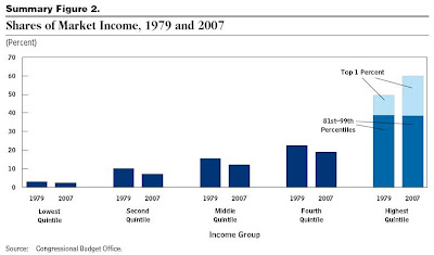
One can look at this underlying data in a different way: What share of total market income did these groups receive in 1979, compared to 2007? And what share of after-tax, after-transfer income did these groups receive in 1979, compared to 2007? The timeframe is a useful one, because it runs from one business cycle peak just before a deep recession in 1979 to another year that is a business cycle peak just before a deep recession. Thus, patterns over this time can't be attributed to comparing a recession year to a nonrecession year. The overall pattern is fairly clear. Whether looking at market income or at after-tax, after-transfer income, the 80th-99th percentile received about the same share of income in 2007 as in 1979. The top 1% got a notably larger share. Each of the lower four-fifths of the income distribution got a lower share.
There is a modest rise in inequality of annual incomes even leaving out the top 1%, but most of the increase in annual income inequality is being driven by rising incomes of the top 1%. It's perhaps useful to add that pointing out the fact of rising inequality doesn't say anything about underlying causes or possible policies.
For a July 18 post on causes of inequality, see "Causes of Inequality: Supply and Demand for Skilled Workers." For an overview of philosophical and economic arguments about inequality, see the September 30 post, "A Critique of the Arguments for Inequality."


